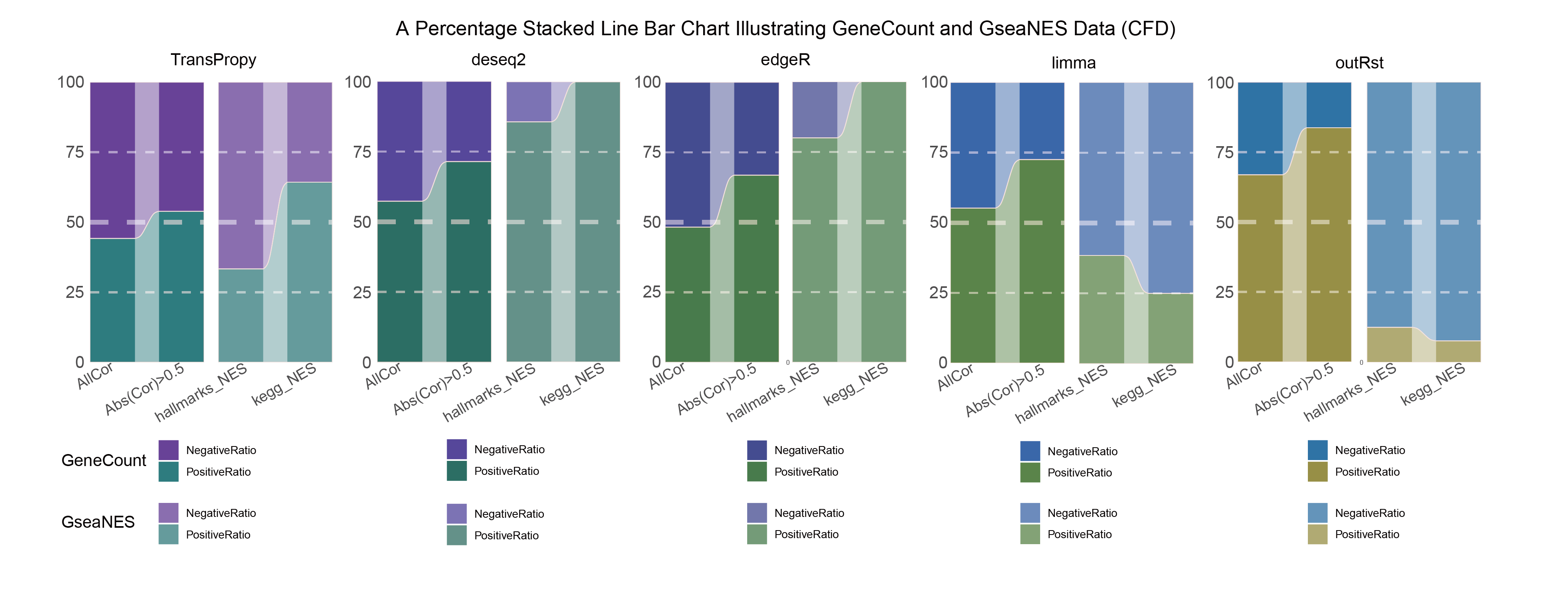
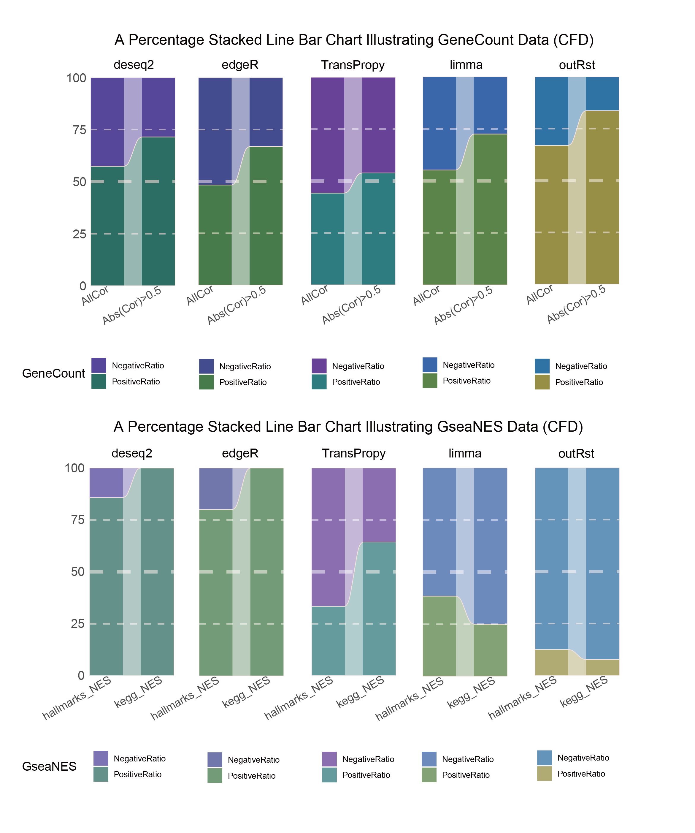
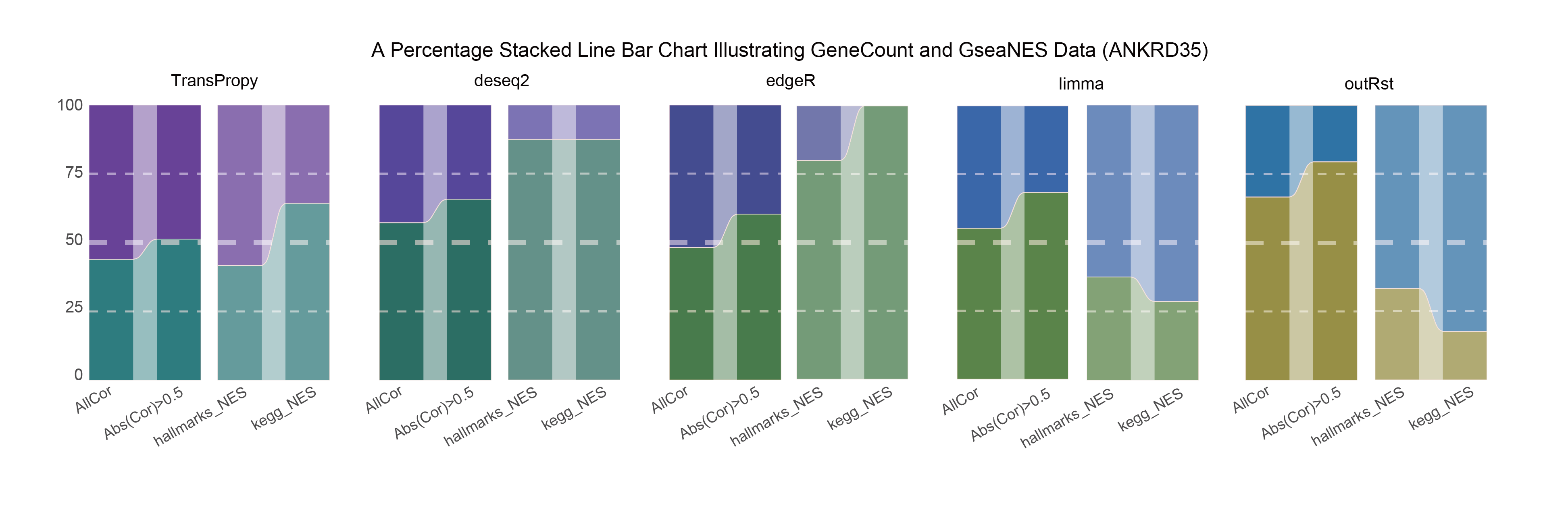
15 Comparison of TransPropy with Other Tool Packages Using GeneCount and GseaNES Data (Gene: CFD/ANKRD35/ALOXE3)
library(readr)
library(TransProR)
library(dplyr)
library(rlang)
library(linkET)
library(funkyheatmap)
library(tidyverse)
library(RColorBrewer)
library(ggalluvial)
library(tidyr)
library(tibble)
library(ggplot2)
library(ggridges)
library(GSVA)
library(fgsea)
library(clusterProfiler)
library(enrichplot)
library(MetaTrx)
15.1 Define a function to mix colors
add_white <- function(color, white_ratio) {
  # Convert hex color to RGB values
  rgb_val <- col2rgb(color) / 255
  # RGB values of white
  white <- c(1, 1, 1)
  # Mix color with white
  mixed_color <- (1 - white_ratio) * rgb_val + white_ratio * white
  # Convert the mixed color back to hex format
  rgb(mixed_color[1], mixed_color[2], mixed_color[3], maxColorValue = 1)
}
15.2 CFD
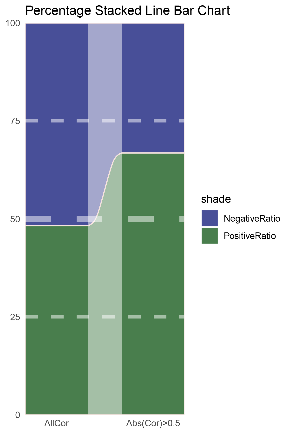
# Script for correlation_TransPropy_CFD
data <- correlation_TransPropy_CFD
total_positive <- sum(data$cor > 0)
total_negative <- sum(data$cor < 0)
positive_above_0_5 <- sum(data$cor > 0.5)
negative_below_minus_0_5 <- sum(data$cor < -0.5)
cat("correlation_TransPropy_CFD\n")
cat("Total positive correlations:", total_positive, "\n")
cat("Total negative correlations:", total_negative, "\n")
cat("Positive correlations above 0.5:", positive_above_0_5, "\n")
cat("Negative correlations below -0.5:", negative_below_minus_0_5, "\n\n")

data = tribble(
  ~Methods,  ~PositiveRatio,  ~NegativeRatio,
  "AllCor",  1165,  1470,
  "Abs(Cor)>0.5",  755,  646,
)
data %>%
  mutate(id = 1:n()) %>%
  pivot_longer(-c(id, Methods), names_to = "shade", values_to = "value") -> df


# Plotting
# Add whiteness
white_ratio <- 0.2  # 20% white
# Define original colors
pal <- c('#4a148c', '#006064')
pal <- as.vector(sapply(pal, add_white, white_ratio = white_ratio))

p1<- df %>%
  mutate(prop = round(value/sum(value)*100, 2), .by = Methods) %>%
  ggplot(aes(x=id, y=prop, fill=shade)) +
  geom_stratum(aes(stratum=shade), color=NA, width = 0.65) +
  geom_flow(aes(alluvium=shade), knot.pos = 0.25, width = 0.65, alpha=0.5) +
  geom_alluvium(aes(alluvium=shade),
                knot.pos = 0.25, color="#f4e2de", width=0.65, linewidth=0.5, fill=NA, alpha=1) +
  scale_fill_manual(values = pal) +
  scale_x_continuous(expand = c(0, 0), breaks = 1:2, labels = data$Methods, name = NULL) +
  scale_y_continuous(expand = c(0, 0),
                      name = NULL) +
  geom_hline(yintercept = c(50),
              linewidth = 3,
              color = 'white',
              lty = 'dashed',
              alpha = 0.5)+
  geom_hline(yintercept = c(25,75),
              linewidth = 1.5,
              color = 'white',
              lty = 'dashed',
              alpha = 0.5)+
  labs(title = "Percentage Stacked Line Bar Chart") +
  theme_minimal() +
  theme(plot.background = element_rect(fill='white', color='white'),
        panel.grid = element_blank())

p1![]()
correlation_TransPropy_CFD_genecount_RATIO
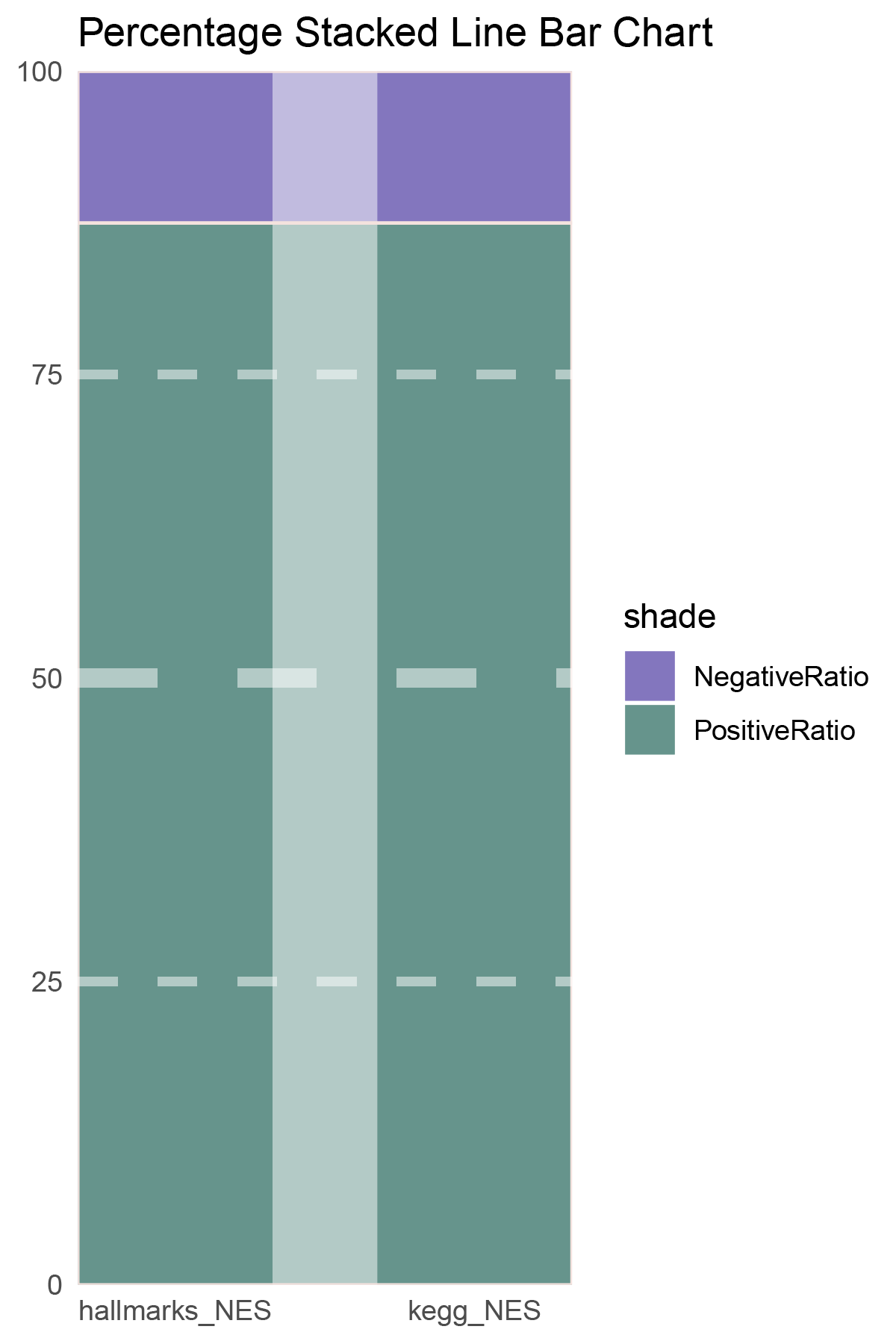
NES_values <- TransPropy_CFD_hallmarks_y@result[ ,"NES"]
# Count the number of positives and negatives
positive_count <- sum(NES_values > 0)
negative_count <- sum(NES_values < 0)
# Print the results
cat("Number of positive values:", positive_count, "\n")
cat("Number of negative values:", negative_count, "\n")

NES_values <- TransPropy_CFD_kegg_y@result[ ,"NES"]
# Count the number of positives and negatives
positive_count <- sum(NES_values > 0)
negative_count <- sum(NES_values < 0)
# Print the results
cat("Number of positive values:", positive_count, "\n")
cat("Number of negative values:", negative_count, "\n")

data = tribble(
  ~Methods,  ~PositiveRatio,  ~NegativeRatio,
  "hallmarks_NES",  3,  6,
  "kegg_NES",  9,  5,
)
data %>%
  mutate(id = 1:n()) %>%
  pivot_longer(-c(id, Methods), names_to = "shade", values_to = "value") -> df

# Plotting
white_ratio <- 0.4
pal <- c('#4a148c', '#006064')
pal <- as.vector(sapply(pal, add_white, white_ratio = white_ratio))
p2 <- df %>%
  mutate(prop = round(value/sum(value)*100, 2), .by = Methods) %>%
  ggplot(aes(x=id, y=prop, fill=shade)) +
  geom_stratum(aes(stratum=shade), color=NA, width = 0.65) +
  geom_flow(aes(alluvium=shade), knot.pos = 0.25, width = 0.65, alpha=0.5) +
  geom_alluvium(aes(alluvium=shade),
                knot.pos = 0.25, color="#f4e2de", width=0.65, linewidth=0.5, fill=NA, alpha=1) +
  scale_fill_manual(values = pal) +
  scale_x_continuous(expand = c(0, 0), breaks = 1:2, labels = data$Methods, name = NULL) +
  scale_y_continuous(expand = c(0, 0),
                      name = NULL) +
  geom_hline(yintercept = c(50),
              linewidth = 3,
              color = 'white',
              lty = 'dashed',
              alpha = 0.5)+
  geom_hline(yintercept = c(25,75),
              linewidth = 1.5,
              color = 'white',
              lty = 'dashed',
              alpha = 0.5)+
  labs(title = "Percentage Stacked Line Bar Chart") +
  theme_minimal() +
  theme(plot.background = element_rect(fill='white', color='white'),
        panel.grid = element_blank())

p2![]()
correlation_TransPropy_CFD_NES_RATIO
# Script for correlation_deseq2_CFD
data <- correlation_deseq2_CFD
total_positive <- sum(data$cor > 0)
total_negative <- sum(data$cor < 0)
positive_above_0_5 <- sum(data$cor > 0.5)
negative_below_minus_0_5 <- sum(data$cor < -0.5)
cat("correlation_deseq2_CFD\n")
cat("Total positive correlations:", total_positive, "\n")
cat("Total negative correlations:", total_negative, "\n")
cat("Positive correlations above 0.5:", positive_above_0_5, "\n")
cat("Negative correlations below -0.5:", negative_below_minus_0_5, "\n\n")


data = tribble(
  ~Methods,  ~PositiveRatio,  ~NegativeRatio,
  "AllCor",  1511,  1124,
  "Abs(Cor)>0.5",  1133,  453,
)
data %>%
  mutate(id = 1:n()) %>%
  pivot_longer(-c(id, Methods), names_to = "shade", values_to = "value") -> df


# Plotting
# Add whiteness
white_ratio <- 0.2  # 20% white
# Define original colors
pal <- c('#311b92', '#004d40')
pal <- as.vector(sapply(pal, add_white, white_ratio = white_ratio))

p3 <- df %>%
  mutate(prop = round(value/sum(value)*100, 2), .by = Methods) %>%
  ggplot(aes(x=id, y=prop, fill=shade)) +
  geom_stratum(aes(stratum=shade), color=NA, width = 0.65) +
  geom_flow(aes(alluvium=shade), knot.pos = 0.25, width = 0.65, alpha=0.5) +
  geom_alluvium(aes(alluvium=shade),
                knot.pos = 0.25, color="#f4e2de", width=0.65, linewidth=0.5, fill=NA, alpha=1) +
  scale_fill_manual(values = pal) +
  scale_x_continuous(expand = c(0, 0), breaks = 1:2, labels = data$Methods, name = NULL) +
  scale_y_continuous(expand = c(0, 0),
                      name = NULL) +
  geom_hline(yintercept = c(50),
              linewidth = 3,
              color = 'white',
              lty = 'dashed',
              alpha = 0.5)+
  geom_hline(yintercept = c(25,75),
              linewidth = 1.5,
              color = 'white',
              lty = 'dashed',
              alpha = 0.5)+
  labs(title = "Percentage Stacked Line Bar Chart") +
  theme_minimal() +
  theme(plot.background = element_rect(fill='white', color='white'),
        panel.grid = element_blank())
p3
correlation_deseq2_CFD_genecount_RATIO
NES_values <- deseq2_CFD_hallmarks_y@result[ ,"NES"]
# Count the number of positives and negatives
positive_count <- sum(NES_values > 0)
negative_count <- sum(NES_values < 0)
# Print the results
cat("Number of positive values:", positive_count, "\n")
cat("Number of negative values:", negative_count, "\n")

NES_values <- deseq2_CFD_kegg_y@result[ ,"NES"]
# Count the number of positives and negatives
positive_count <- sum(NES_values > 0)
negative_count <- sum(NES_values < 0)
# Print the results
cat("Number of positive values:", positive_count, "\n")
cat("Number of negative values:", negative_count, "\n")

data = tribble(
  ~Methods,  ~PositiveRatio,  ~NegativeRatio,
  "hallmarks_NES",  6,  1,
  "kegg_NES",  7,  0,
)
data %>%
  mutate(id = 1:n()) %>%
  pivot_longer(-c(id, Methods), names_to = "shade", values_to = "value") -> df

# Plotting
white_ratio <- 0.4
pal <- c('#311b92', '#004d40')
pal <- as.vector(sapply(pal, add_white, white_ratio = white_ratio))
p4 <- df %>%
  mutate(prop = round(value/sum(value)*100, 2), .by = Methods) %>%
  ggplot(aes(x=id, y=prop, fill=shade)) +
  geom_stratum(aes(stratum=shade), color=NA, width = 0.65) +
  geom_flow(aes(alluvium=shade), knot.pos = 0.25, width = 0.65, alpha=0.5) +
  geom_alluvium(aes(alluvium=shade),
                knot.pos = 0.25, color="#f4e2de", width=0.65, linewidth=0.5, fill=NA, alpha=1) +
  scale_fill_manual(values = pal) +
  scale_x_continuous(expand = c(0, 0), breaks = 1:2, labels = data$Methods, name = NULL) +
  scale_y_continuous(expand = c(0, 0),
                      name = NULL) +
  geom_hline(yintercept = c(50),
              linewidth = 3,
              color = 'white',
              lty = 'dashed',
              alpha = 0.5)+
  geom_hline(yintercept = c(25,75),
              linewidth = 1.5,
              color = 'white',
              lty = 'dashed',
              alpha = 0.5)+
  labs(title = "Percentage Stacked Line Bar Chart") +
  theme_minimal() +
  theme(plot.background = element_rect(fill='white', color='white'),
        panel.grid = element_blank())

p4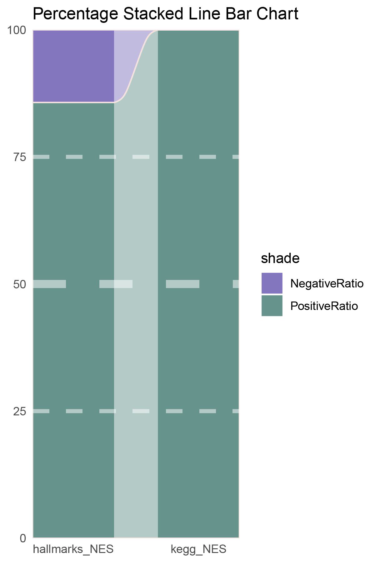
correlation_deseq2_CFD_NES_RATIO
# Script for correlation_edgeR_CFD
data <- correlation_edgeR_CFD
total_positive <- sum(data$cor > 0)
total_negative <- sum(data$cor < 0)
positive_above_0_5 <- sum(data$cor > 0.5)
negative_below_minus_0_5 <- sum(data$cor < -0.5)
cat("correlation_edgeR_CFD\n")
cat("Total positive correlations:", total_positive, "\n")
cat("Total negative correlations:", total_negative, "\n")
cat("Positive correlations above 0.5:", positive_above_0_5, "\n")
cat("Negative correlations below -0.5:", negative_below_minus_0_5, "\n\n")


data = tribble(
  ~Methods,  ~PositiveRatio,  ~NegativeRatio,
  "AllCor",  1272,  1363,
  "Abs(Cor)>0.5",  935,  464,
)
data %>%
  mutate(id = 1:n()) %>%
  pivot_longer(-c(id, Methods), names_to = "shade", values_to = "value") -> df


# Plotting
# Add whiteness
white_ratio <- 0.2  # 20% white
# Define original colors
pal <- c('#1a237e', '#1b5e20')
pal <- as.vector(sapply(pal, add_white, white_ratio = white_ratio))

p5 <- df %>%
  mutate(prop = round(value/sum(value)*100, 2), .by = Methods) %>%
  ggplot(aes(x=id, y=prop, fill=shade)) +
  geom_stratum(aes(stratum=shade), color=NA, width = 0.65) +
  geom_flow(aes(alluvium=shade), knot.pos = 0.25, width = 0.65, alpha=0.5) +
  geom_alluvium(aes(alluvium=shade),
                knot.pos = 0.25, color="#f4e2de", width=0.65, linewidth=0.5, fill=NA, alpha=1) +
  scale_fill_manual(values = pal) +
  scale_x_continuous(expand = c(0, 0), breaks = 1:2, labels = data$Methods, name = NULL) +
  scale_y_continuous(expand = c(0, 0),
                      name = NULL) +
  geom_hline(yintercept = c(50),
              linewidth = 3,
              color = 'white',
              lty = 'dashed',
              alpha = 0.5)+
  geom_hline(yintercept = c(25,75),
              linewidth = 1.5,
              color = 'white',
              lty = 'dashed',
              alpha = 0.5)+
  labs(title = "Percentage Stacked Line Bar Chart") +
  theme_minimal() +
  theme(plot.background = element_rect(fill='white', color='white'),
        panel.grid = element_blank())
p5
correlation_edgeR_CFD_genecount_RATIO
NES_values <- edgeR_CFD_hallmarks_y@result[ ,"NES"]
# Count the number of positives and negatives
positive_count <- sum(NES_values > 0)
negative_count <- sum(NES_values < 0)
# Print the results
cat("Number of positive values:", positive_count, "\n")
cat("Number of negative values:", negative_count, "\n")

NES_values <- edgeR_CFD_kegg_y@result[ ,"NES"]
# Count the number of positives and negatives
positive_count <- sum(NES_values > 0)
negative_count <- sum(NES_values < 0)
# Print the results
cat("Number of positive values:", positive_count, "\n")
cat("Number of negative values:", negative_count, "\n")

data = tribble(
  ~Methods,  ~PositiveRatio,  ~NegativeRatio,
  "hallmarks_NES",  4,  1,
  "kegg_NES",  5,  0,
)
data %>%
  mutate(id = 1:n()) %>%
  pivot_longer(-c(id, Methods), names_to = "shade", values_to = "value") -> df

# Plotting
white_ratio <- 0.4
pal <- c('#1a237e', '#1b5e20')
pal <- as.vector(sapply(pal, add_white, white_ratio = white_ratio))
p6 <- df %>%
  mutate(prop = round(value/sum(value)*100, 2), .by = Methods) %>%
  ggplot(aes(x=id, y=prop, fill=shade)) +
  geom_stratum(aes(stratum=shade), color=NA, width = 0.65) +
  geom_flow(aes(alluvium=shade), knot.pos = 0.25, width = 0.65, alpha=0.5) +
  geom_alluvium(aes(alluvium=shade),
                knot.pos = 0.25, color="#f4e2de", width=0.65, linewidth=0.5, fill=NA, alpha=1) +
  scale_fill_manual(values = pal) +
  scale_x_continuous(expand = c(0, 0), breaks = 1:2, labels = data$Methods, name = NULL) +
  scale_y_continuous(expand = c(0, 0),
                      name = NULL) +
  geom_hline(yintercept = c(50),
              linewidth = 3,
              color = 'white',
              lty = 'dashed',
              alpha = 0.5)+
  geom_hline(yintercept = c(25,75),
              linewidth = 1.5,
              color = 'white',
              lty = 'dashed',
              alpha = 0.5)+
  labs(title = "Percentage Stacked Line Bar Chart") +
  theme_minimal() +
  theme(plot.background = element_rect(fill='white', color='white'),
        panel.grid = element_blank())

p6
correlation_edgeR_CFD_NES_RATIO
# Script for correlation_limma_CFD
data <- correlation_limma_CFD
total_positive <- sum(data$cor > 0)
total_negative <- sum(data$cor < 0)
positive_above_0_5 <- sum(data$cor > 0.5)
negative_below_minus_0_5 <- sum(data$cor < -0.5)
cat("correlation_limma_CFD\n")
cat("Total positive correlations:", total_positive, "\n")
cat("Total negative correlations:", total_negative, "\n")
cat("Positive correlations above 0.5:", positive_above_0_5, "\n")
cat("Negative correlations below -0.5:", negative_below_minus_0_5, "\n\n")


data = tribble(
  ~Methods,  ~PositiveRatio,  ~NegativeRatio,
  "AllCor",  1455,  1180,
  "Abs(Cor)>0.5",  1290,  489,
)
data %>%
  mutate(id = 1:n()) %>%
  pivot_longer(-c(id, Methods), names_to = "shade", values_to = "value") -> df


# Plotting
# Add whiteness
white_ratio <- 0.2  # 20% white
# Define original colors
pal <- c('#0d47a1', '#33691e')
pal <- as.vector(sapply(pal, add_white, white_ratio = white_ratio))

p7 <- df %>%
  mutate(prop = round(value/sum(value)*100, 2), .by = Methods) %>%
  ggplot(aes(x=id, y=prop, fill=shade)) +
  geom_stratum(aes(stratum=shade), color=NA, width = 0.65) +
  geom_flow(aes(alluvium=shade), knot.pos = 0.25, width = 0.65, alpha=0.5) +
  geom_alluvium(aes(alluvium=shade),
                knot.pos = 0.25, color="#f4e2de", width=0.65, linewidth=0.5, fill=NA, alpha=1) +
  scale_fill_manual(values = pal) +
  scale_x_continuous(expand = c(0, 0), breaks = 1:2, labels = data$Methods, name = NULL) +
  scale_y_continuous(expand = c(0, 0),
                      name = NULL) +
  geom_hline(yintercept = c(50),
              linewidth = 3,
              color = 'white',
              lty = 'dashed',
              alpha = 0.5)+
  geom_hline(yintercept = c(25,75),
              linewidth = 1.5,
              color = 'white',
              lty = 'dashed',
              alpha = 0.5)+
  labs(title = "Percentage Stacked Line Bar Chart") +
  theme_minimal() +
  theme(plot.background = element_rect(fill='white', color='white'),
        panel.grid = element_blank())
p7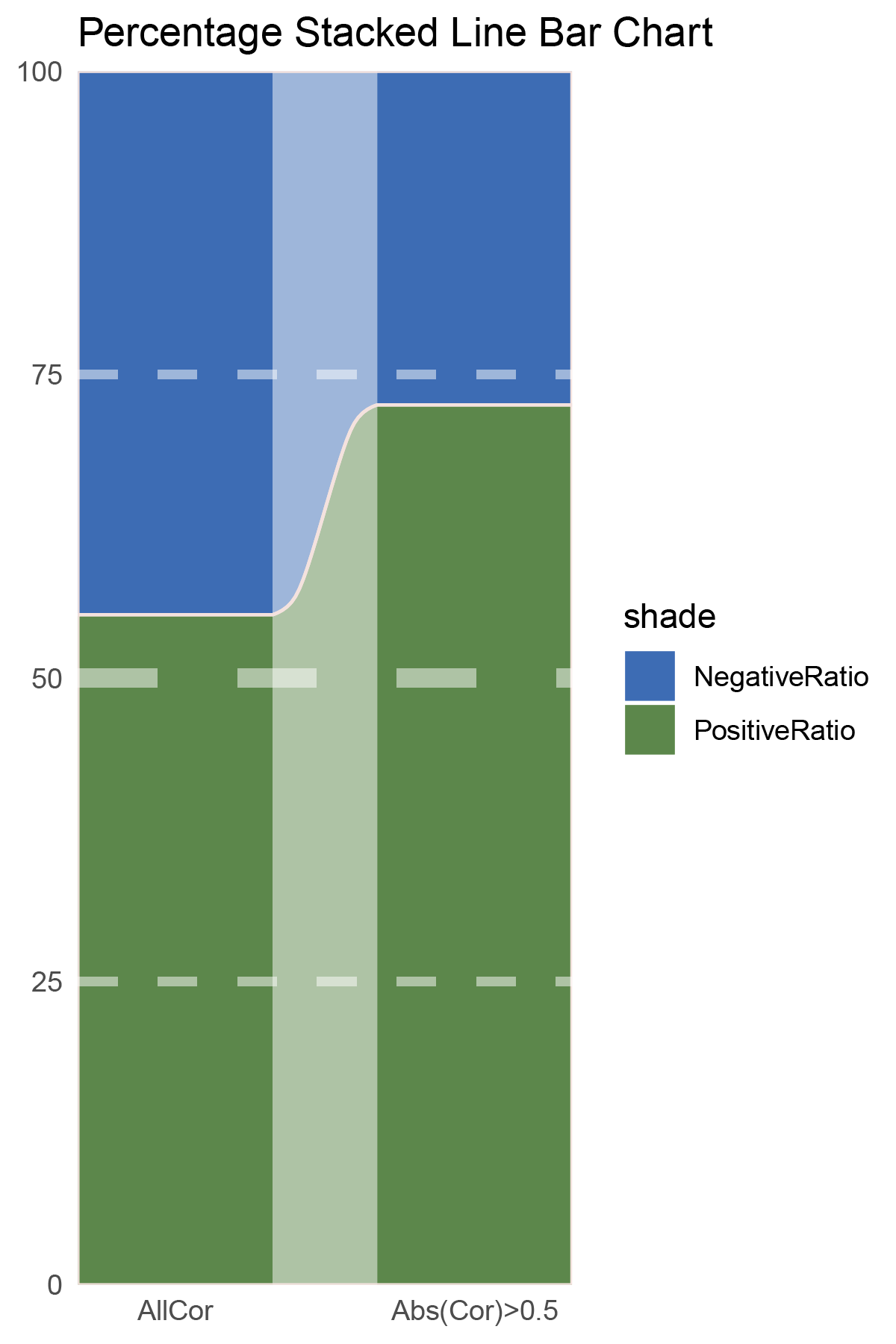
correlation_limma_CFD_genecount_RATIO
NES_values <- limma_CFD_hallmarks_y@result[ ,"NES"]
# Count the number of positives and negatives
positive_count <- sum(NES_values > 0)
negative_count <- sum(NES_values < 0)
# Print the results
cat("Number of positive values:", positive_count, "\n")
cat("Number of negative values:", negative_count, "\n")

NES_values <- limma_CFD_kegg_y@result[ ,"NES"]
# Count the number of positives and negatives
positive_count <- sum(NES_values > 0)
negative_count <- sum(NES_values < 0)
# Print the results
cat("Number of positive values:", positive_count, "\n")
cat("Number of negative values:", negative_count, "\n")

data = tribble(
  ~Methods,  ~PositiveRatio,  ~NegativeRatio,
  "hallmarks_NES",  5,  8,
  "kegg_NES",  3,  9,
)
data %>%
  mutate(id = 1:n()) %>%
  pivot_longer(-c(id, Methods), names_to = "shade", values_to = "value") -> df

# Plotting
white_ratio <- 0.4
pal <- c('#0d47a1', '#33691e')
pal <- as.vector(sapply(pal, add_white, white_ratio = white_ratio))
p8 <- df %>%
  mutate(prop = round(value/sum(value)*100, 2), .by = Methods) %>%
  ggplot(aes(x=id, y=prop, fill=shade)) +
  geom_stratum(aes(stratum=shade), color=NA, width = 0.65) +
  geom_flow(aes(alluvium=shade), knot.pos = 0.25, width = 0.65, alpha=0.5) +
  geom_alluvium(aes(alluvium=shade),
                knot.pos = 0.25, color="#f4e2de", width=0.65, linewidth=0.5, fill=NA, alpha=1) +
  scale_fill_manual(values = pal) +
  scale_x_continuous(expand = c(0, 0), breaks = 1:2, labels = data$Methods, name = NULL) +
  scale_y_continuous(expand = c(0, 0),
                      name = NULL) +
  geom_hline(yintercept = c(50),
              linewidth = 3,
              color = 'white',
              lty = 'dashed',
              alpha = 0.5)+
  geom_hline(yintercept = c(25,75),
              linewidth = 1.5,
              color = 'white',
              lty = 'dashed',
              alpha = 0.5)+
  labs(title = "Percentage Stacked Line Bar Chart") +
  theme_minimal() +
  theme(plot.background = element_rect(fill='white', color='white'),
        panel.grid = element_blank())

p8
correlation_limma_CFD_NES_RATIO
# Script for correlation_outRst_CFD
data <- correlation_outRst_CFD
total_positive <- sum(data$cor > 0)
total_negative <- sum(data$cor < 0)
positive_above_0_5 <- sum(data$cor > 0.5)
negative_below_minus_0_5 <- sum(data$cor < -0.5)
cat("correlation_outRst_CFD\n")
cat("Total positive correlations:", total_positive, "\n")
cat("Total negative correlations:", total_negative, "\n")
cat("Positive correlations above 0.5:", positive_above_0_5, "\n")
cat("Negative correlations below -0.5:", negative_below_minus_0_5, "\n\n")


data = tribble(
  ~Methods,  ~PositiveRatio,  ~NegativeRatio,
  "AllCor",  1763,  872,
  "Abs(Cor)>0.5",  1480,  288,
)
data %>%
  mutate(id = 1:n()) %>%
  pivot_longer(-c(id, Methods), names_to = "shade", values_to = "value") -> df


# Plotting
# Add whiteness
white_ratio <- 0.2  # 20% white
# Define original colors
pal <- c('#01579b', '#827717')
pal <- as.vector(sapply(pal, add_white, white_ratio = white_ratio))

p9 <- df %>%
  mutate(prop = round(value/sum(value)*100, 2), .by = Methods) %>%
  ggplot(aes(x=id, y=prop, fill=shade)) +
  geom_stratum(aes(stratum=shade), color=NA, width = 0.65) +
  geom_flow(aes(alluvium=shade), knot.pos = 0.25, width = 0.65, alpha=0.5) +
  geom_alluvium(aes(alluvium=shade),
                knot.pos = 0.25, color="#f4e2de", width=0.65, linewidth=0.5, fill=NA, alpha=1) +
  scale_fill_manual(values = pal) +
  scale_x_continuous(expand = c(0, 0), breaks = 1:2, labels = data$Methods, name = NULL) +
  scale_y_continuous(expand = c(0, 0),
                      name = NULL) +
  geom_hline(yintercept = c(50),
              linewidth = 3,
              color = 'white',
              lty = 'dashed',
              alpha = 0.5)+
  geom_hline(yintercept = c(25,75),
              linewidth = 1.5,
              color = 'white',
              lty = 'dashed',
              alpha = 0.5)+
  labs(title = "Percentage Stacked Line Bar Chart") +
  theme_minimal() +
  theme(plot.background = element_rect(fill='white', color='white'),
        panel.grid = element_blank())
p9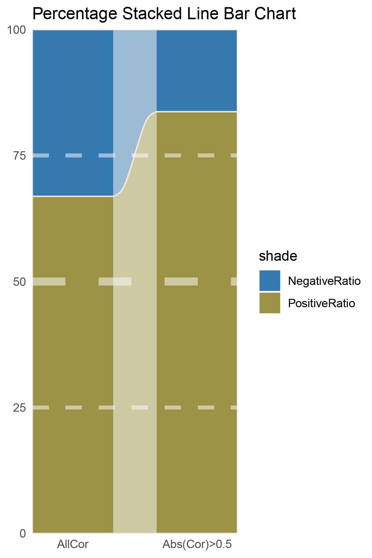
correlation_outRst_CFD_genecount_RATIO
NES_values <- outRst_CFD_hallmarks_y@result[ ,"NES"]
# Count the number of positives and negatives
positive_count <- sum(NES_values > 0)
negative_count <- sum(NES_values < 0)
# Print the results
cat("Number of positive values:", positive_count, "\n")
cat("Number of negative values:", negative_count, "\n")

NES_values <- outRst_CFD_kegg_y@result[ ,"NES"]
# Count the number of positives and negatives
positive_count <- sum(NES_values > 0)
negative_count <- sum(NES_values < 0)
# Print the results
cat("Number of positive values:", positive_count, "\n")
cat("Number of negative values:", negative_count, "\n")

data = tribble(
  ~Methods,  ~PositiveRatio,  ~NegativeRatio,
  "hallmarks_NES",  1,  7,
  "kegg_NES",  1,  12,
)
data %>%
  mutate(id = 1:n()) %>%
  pivot_longer(-c(id, Methods), names_to = "shade", values_to = "value") -> df

# Plotting
white_ratio <- 0.4
pal <- c('#01579b', '#827717')
pal <- as.vector(sapply(pal, add_white, white_ratio = white_ratio))
p10 <- df %>%
  mutate(prop = round(value/sum(value)*100, 2), .by = Methods) %>%
  ggplot(aes(x=id, y=prop, fill=shade)) +
  geom_stratum(aes(stratum=shade), color=NA, width = 0.65) +
  geom_flow(aes(alluvium=shade), knot.pos = 0.25, width = 0.65, alpha=0.5) +
  geom_alluvium(aes(alluvium=shade),
                knot.pos = 0.25, color="#f4e2de", width=0.65, linewidth=0.5, fill=NA, alpha=1) +
  scale_fill_manual(values = pal) +
  scale_x_continuous(expand = c(0, 0), breaks = 1:2, labels = data$Methods, name = NULL) +
  scale_y_continuous(expand = c(0, 0),
                      name = NULL) +
  geom_hline(yintercept = c(50),
              linewidth = 3,
              color = 'white',
              lty = 'dashed',
              alpha = 0.5)+
  geom_hline(yintercept = c(25,75),
              linewidth = 1.5,
              color = 'white',
              lty = 'dashed',
              alpha = 0.5)+
  labs(title = "Percentage Stacked Line Bar Chart") +
  theme_minimal() +
  theme(plot.background = element_rect(fill='white', color='white'),
        panel.grid = element_blank())

p10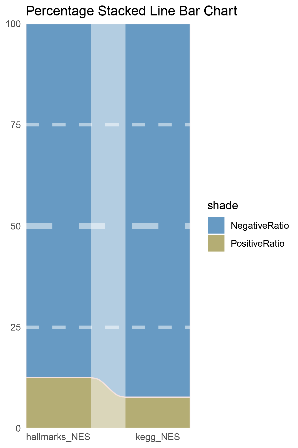
correlation_outRst_CFD_NES_RATIO
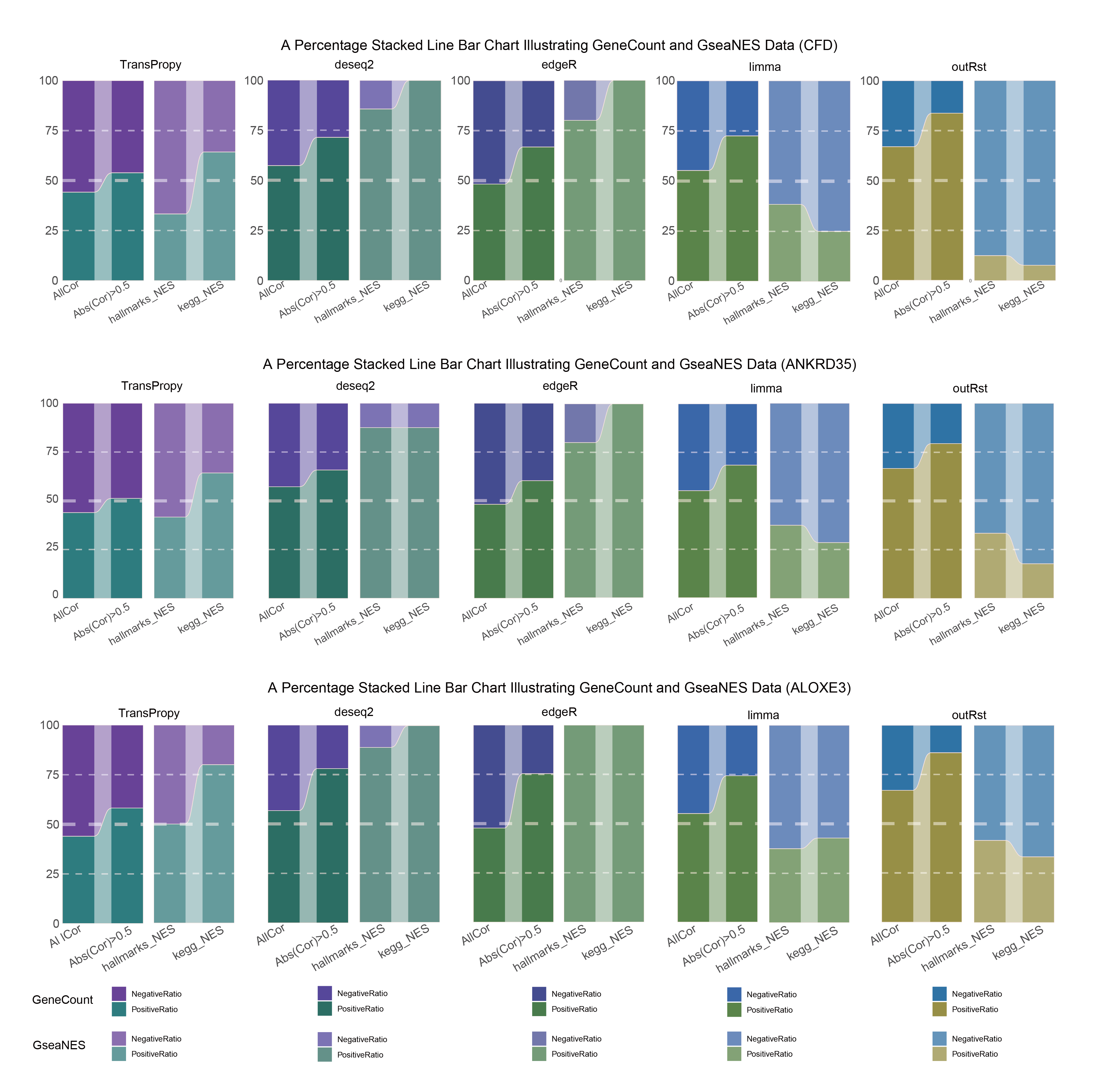
15.2.1 CFD_ALL
CFD_ALL_RATIO
15.2.2 CFD_seprate
CFD_seprate_RATIO
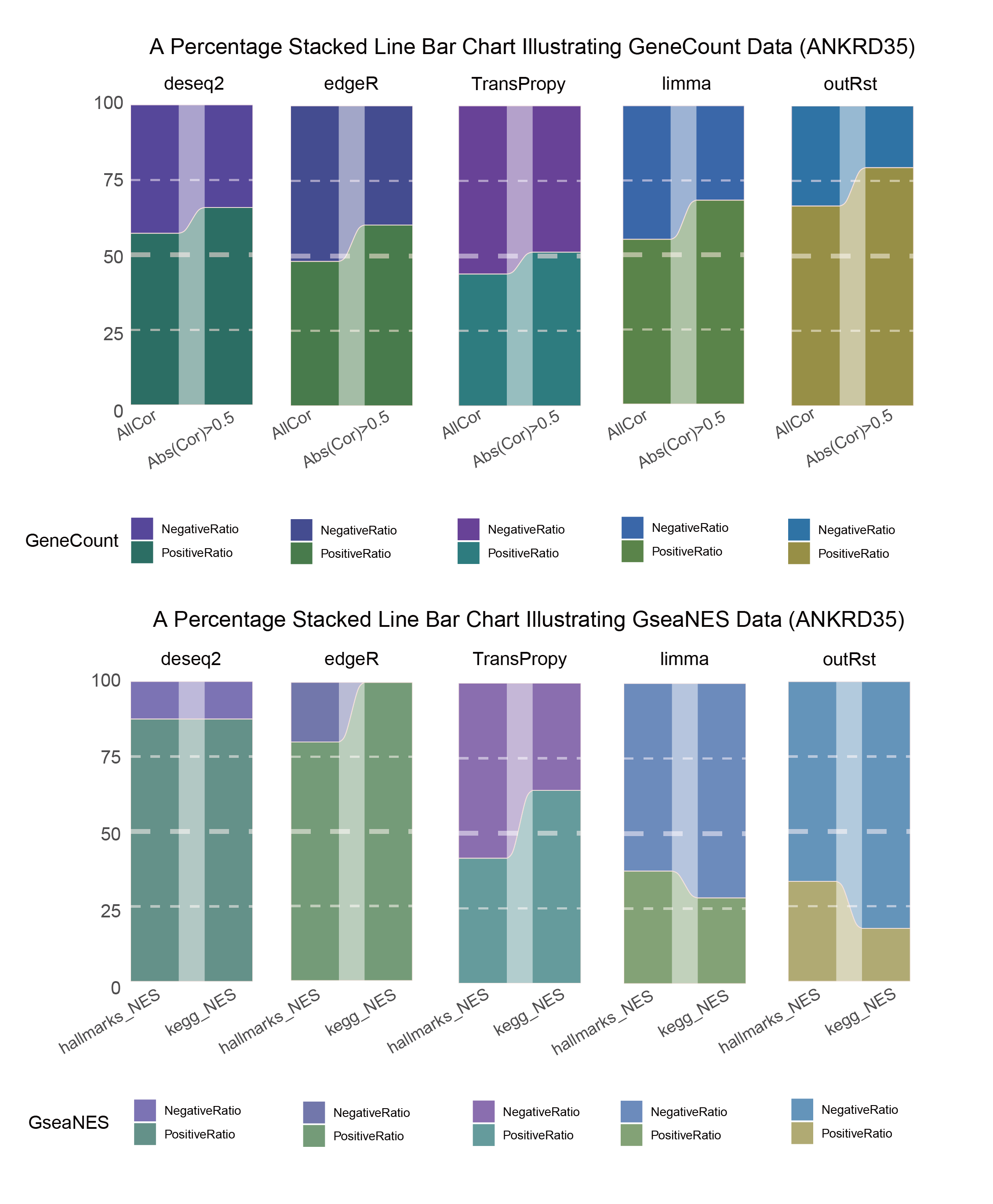
15.3 ANKRD35
# Script for correlation_TransPropy_ANKRD35
data <- correlation_TransPropy_ANKRD35
total_positive <- sum(data$cor > 0)
total_negative <- sum(data$cor < 0)
positive_above_0_5 <- sum(data$cor > 0.5)
negative_below_minus_0_5 <- sum(data$cor < -0.5)
cat("correlation_TransPropy_ANKRD35\n")
cat("Total positive correlations:", total_positive, "\n")
cat("Total negative correlations:", total_negative, "\n")
cat("Positive correlations above 0.5:", positive_above_0_5, "\n")
cat("Negative correlations below -0.5:", negative_below_minus_0_5, "\n\n")

data = tribble(
  ~Methods,  ~PositiveRatio,  ~NegativeRatio,
  "AllCor",  1158,  1477,
  "Abs(Cor)>0.5",  822,  782,
)
data %>%
  mutate(id = 1:n()) %>%
  pivot_longer(-c(id, Methods), names_to = "shade", values_to = "value") -> df

# Plotting
# Add whiteness
white_ratio <- 0.2  # 20% white
# Define original colors
pal <- c('#4a148c', '#006064')
pal <- as.vector(sapply(pal, add_white, white_ratio = white_ratio))

p11 <- df %>%
  mutate(prop = round(value/sum(value)*100, 2), .by = Methods) %>%
  ggplot(aes(x=id, y=prop, fill=shade)) +
  geom_stratum(aes(stratum=shade), color=NA, width = 0.65) +
  geom_flow(aes(alluvium=shade), knot.pos = 0.25, width = 0.65, alpha=0.5) +
  geom_alluvium(aes(alluvium=shade),
                knot.pos = 0.25, color="#f4e2de", width=0.65, linewidth=0.5, fill=NA, alpha=1) +
  scale_fill_manual(values = pal) +
  scale_x_continuous(expand = c(0, 0), breaks = 1:2, labels = data$Methods, name = NULL) +
  scale_y_continuous(expand = c(0, 0),
                      # limits = c(0, 10000),
                      name = NULL) +
  geom_hline(yintercept = c(50),
              linewidth = 3,
              color = 'white',
              lty = 'dashed',
              alpha = 0.5)+
  geom_hline(yintercept = c(25,75),
              linewidth = 1.5,
              color = 'white',
              lty = 'dashed',
              alpha = 0.5)+
  labs(title = "Percentage Stacked Line Bar Chart") +
  theme_minimal() +
  theme(plot.background = element_rect(fill='white', color='white'),
        panel.grid = element_blank())

p11![]()
correlation_TransPropy_ANKRD35_genecount_RATIO
NES_values <- TransPropy_ANKRD35_hallmarks_y@result[ ,"NES"]
# Calculate the number of positive and negative values
positive_count <- sum(NES_values > 0)
negative_count <- sum(NES_values < 0)
# Print results
cat("Number of positive values:", positive_count, "\n")
cat("Number of negative values:", negative_count, "\n")

NES_values <- TransPropy_ANKRD35_kegg_y@result[ ,"NES"]
# Calculate the number of positive and negative values
positive_count <- sum(NES_values > 0)
negative_count <- sum(NES_values < 0)
# Print results
cat("Number of positive values:", positive_count, "\n")
cat("Number of negative values:", negative_count, "\n")

data = tribble(
  ~Methods,  ~PositiveRatio,  ~NegativeRatio,
  "hallmarks_NES",  5,  7,
  "kegg_NES",  9,  5,
)
data %>%
  mutate(id = 1:n()) %>%
  pivot_longer(-c(id, Methods), names_to = "shade", values_to = "value") -> df

# Plotting
white_ratio <- 0.4
pal <- c('#4a148c', '#006064')
pal <- as.vector(sapply(pal, add_white, white_ratio = white_ratio))
p12 <- df %>%
  mutate(prop = round(value/sum(value)*100, 2), .by = Methods) %>%
  ggplot(aes(x=id, y=prop, fill=shade)) +
  geom_stratum(aes(stratum=shade), color=NA, width = 0.65) +
  geom_flow(aes(alluvium=shade), knot.pos = 0.25, width = 0.65, alpha=0.5) +
  geom_alluvium(aes(alluvium=shade),
                knot.pos = 0.25, color="#f4e2de", width=0.65, linewidth=0.5, fill=NA, alpha=1) +
  scale_fill_manual(values = pal) +
  scale_x_continuous(expand = c(0, 0), breaks = 1:2, labels = data$Methods, name = NULL) +
  scale_y_continuous(expand = c(0, 0),
                      # limits = c(0, 10000),
                      name = NULL) +
  geom_hline(yintercept = c(50),
              linewidth = 3,
              color = 'white',
              lty = 'dashed',
              alpha = 0.5)+
  geom_hline(yintercept = c(25,75),
              linewidth = 1.5,
              color = 'white',
              lty = 'dashed',
              alpha = 0.5)+
  labs(title = "Percentage Stacked Line Bar Chart") +
  theme_minimal() +
  theme(plot.background = element_rect(fill='white', color='white'),
        panel.grid = element_blank())

p12![]()
correlation_TransPropy_ANKRD35_NES_RATIO
# Script for correlation_deseq2_ANKRD35
data <- correlation_deseq2_ANKRD35
total_positive <- sum(data$cor > 0)
total_negative <- sum(data$cor < 0)
positive_above_0_5 <- sum(data$cor > 0.5)
negative_below_minus_0_5 <- sum(data$cor < -0.5)
cat("correlation_deseq2_ANKRD35\n")
cat("Total positive correlations:", total_positive, "\n")
cat("Total negative correlations:", total_negative, "\n")
cat("Positive correlations above 0.5:", positive_above_0_5, "\n")
cat("Negative correlations below -0.5:", negative_below_minus_0_5, "\n\n")

data = tribble(
  ~Methods,  ~PositiveRatio,  ~NegativeRatio,
  "AllCor",  1508,  1127,
  "Abs(Cor)>0.5",  1190,  619,
)
data %>%
  mutate(id = 1:n()) %>%
  pivot_longer(-c(id, Methods), names_to = "shade", values_to = "value") -> df

# Plotting
# Add whiteness
white_ratio <- 0.2  # 20% white
# Define original colors
pal <- c('#311b92', '#004d40')
pal <- as.vector(sapply(pal, add_white, white_ratio = white_ratio))

p13 <- df %>%
  mutate(prop = round(value/sum(value)*100, 2), .by = Methods) %>%
  ggplot(aes(x=id, y=prop, fill=shade)) +
  geom_stratum(aes(stratum=shade), color=NA, width = 0.65) +
  geom_flow(aes(alluvium=shade), knot.pos = 0.25, width = 0.65, alpha=0.5) +
  geom_alluvium(aes(alluvium=shade),
                knot.pos = 0.25, color="#f4e2de", width=0.65, linewidth=0.5, fill=NA, alpha=1) +
  scale_fill_manual(values = pal) +
  scale_x_continuous(expand = c(0, 0), breaks = 1:2, labels = data$Methods, name = NULL) +
  scale_y_continuous(expand = c(0, 0),
                      # limits = c(0, 10000),
                      name = NULL) +
  geom_hline(yintercept = c(50),
              linewidth = 3,
              color = 'white',
              lty = 'dashed',
              alpha = 0.5)+
  geom_hline(yintercept = c(25,75),
              linewidth = 1.5,
              color = 'white',
              lty = 'dashed',
              alpha = 0.5)+
  labs(title = "Percentage Stacked Line Bar Chart") +
  theme_minimal() +
  theme(plot.background = element_rect(fill='white', color='white'),
        panel.grid = element_blank())
p13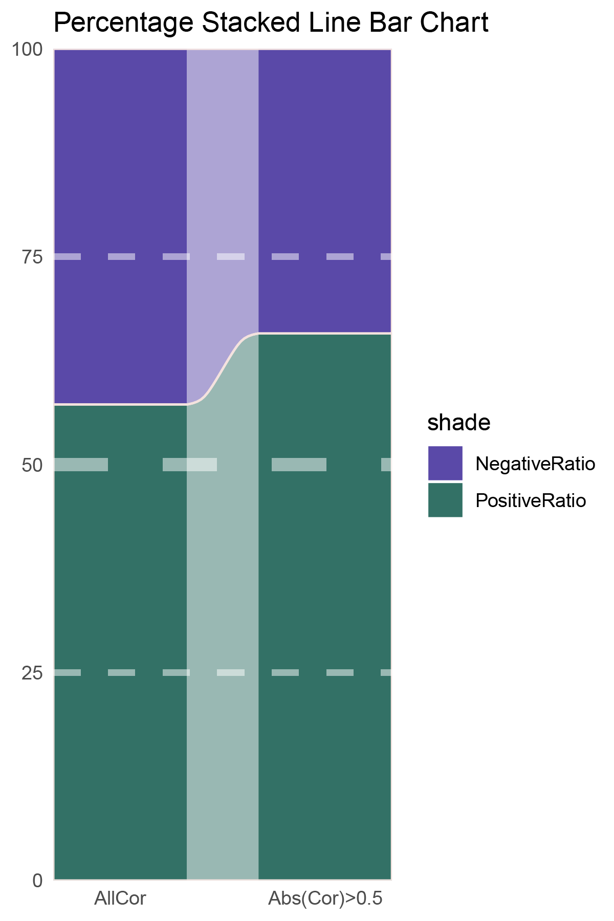
correlation_deseq2_ANKRD35_genecount_RATIO
NES_values <- deseq2_ANKRD35_hallmarks_y@result[ ,"NES"]
# Calculate the number of positive and negative values
positive_count <- sum(NES_values > 0)
negative_count <- sum(NES_values < 0)
# Print results
cat("Number of positive values:", positive_count, "\n")
cat("Number of negative values:", negative_count, "\n")

NES_values <- deseq2_ANKRD35_kegg_y@result[ ,"NES"]
# Calculate the number of positive and negative values
positive_count <- sum(NES_values > 0)
negative_count <- sum(NES_values < 0)
# Print results
cat("Number of positive values:", positive_count, "\n")
cat("Number of negative values:", negative_count, "\n")

data = tribble(
  ~Methods,  ~PositiveRatio,  ~NegativeRatio,
  "hallmarks_NES",  7,  1,
  "kegg_NES",  7,  1,
)
data %>%
  mutate(id = 1:n()) %>%
  pivot_longer(-c(id, Methods), names_to = "shade", values_to = "value") -> df

# Plotting
white_ratio <- 0.4
pal <- c('#311b92', '#004d40')
pal <- as.vector(sapply(pal, add_white, white_ratio = white_ratio))
p14 <- df %>%
  mutate(prop = round(value/sum(value)*100, 2), .by = Methods) %>%
  ggplot(aes(x=id, y=prop, fill=shade)) +
  geom_stratum(aes(stratum=shade), color=NA, width = 0.65) +
  geom_flow(aes(alluvium=shade), knot.pos = 0.25, width = 0.65, alpha=0.5) +
  geom_alluvium(aes(alluvium=shade),
                knot.pos = 0.25, color="#f4e2de", width=0.65, linewidth=0.5, fill=NA, alpha=1) +
  scale_fill_manual(values = pal) +
  scale_x_continuous(expand = c(0, 0), breaks = 1:2, labels = data$Methods, name = NULL) +
  scale_y_continuous(expand = c(0, 0),
                      # limits = c(0, 10000),
                      name = NULL) +
  geom_hline(yintercept = c(50),
              linewidth = 3,
              color = 'white',
              lty = 'dashed',
              alpha = 0.5)+
  geom_hline(yintercept = c(25,75),
              linewidth = 1.5,
              color = 'white',
              lty = 'dashed',
              alpha = 0.5)+
  labs(title = "Percentage Stacked Line Bar Chart") +
  theme_minimal() +
  theme(plot.background = element_rect(fill='white', color='white'),
        panel.grid = element_blank())

p14
correlation_deseq2_ANKRD35_NES_RATIO
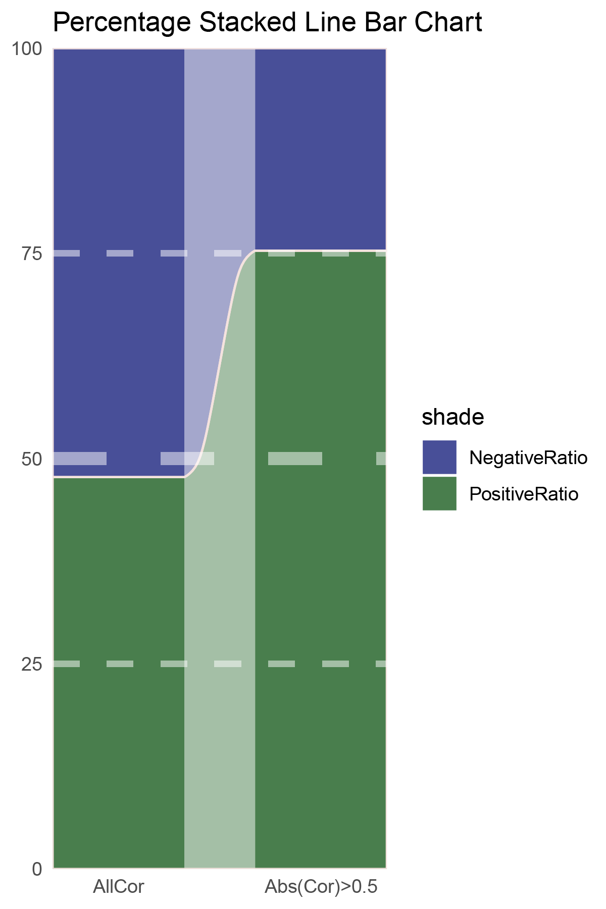
# Script for correlation_edgeR_ANKRD35
data <- correlation_edgeR_ANKRD35
total_positive <- sum(data$cor > 0)
total_negative <- sum(data$cor < 0)
positive_above_0_5 <- sum(data$cor > 0.5)
negative_below_minus_0_5 <- sum(data$cor < -0.5)
cat("correlation_edgeR_ANKRD35\n")
cat("Total positive correlations:", total_positive, "\n")
cat("Total negative correlations:", total_negative, "\n")
cat("Positive correlations above 0.5:", positive_above_0_5, "\n")
cat("Negative correlations below -0.5:", negative_below_minus_0_5, "\n\n")

data = tribble(
  ~Methods,  ~PositiveRatio,  ~NegativeRatio,
  "AllCor",  1269,  1366,
  "Abs(Cor)>0.5",  984,  648,
)
data %>%
  mutate(id = 1:n()) %>%
  pivot_longer(-c(id, Methods), names_to = "shade", values_to = "value") -> df

# Plotting
# Add whiteness
white_ratio <- 0.2  # 20% white
# Define original colors
pal <- c('#1a237e', '#1b5e20')
pal <- as.vector(sapply(pal, add_white, white_ratio = white_ratio))

p15 <- df %>%
  mutate(prop = round(value/sum(value)*100, 2), .by = Methods) %>%
  ggplot(aes(x=id, y=prop, fill=shade)) +
  geom_stratum(aes(stratum=shade), color=NA, width = 0.65) +
  geom_flow(aes(alluvium=shade), knot.pos = 0.25, width = 0.65, alpha=0.5) +
  geom_alluvium(aes(alluvium=shade),
                knot.pos = 0.25, color="#f4e2de", width=0.65, linewidth=0.5, fill=NA, alpha=1) +
  scale_fill_manual(values = pal) +
  scale_x_continuous(expand = c(0, 0), breaks = 1:2, labels = data$Methods, name = NULL) +
  scale_y_continuous(expand = c(0, 0),
                      # limits = c(0, 10000),
                      name = NULL) +
  geom_hline(yintercept = c(50),
              linewidth = 3,
              color = 'white',
              lty = 'dashed',
              alpha = 0.5)+
  geom_hline(yintercept = c(25,75),
              linewidth = 1.5,
              color = 'white',
              lty = 'dashed',
              alpha = 0.5)+
  labs(title = "Percentage Stacked Line Bar Chart") +
  theme_minimal() +
  theme(plot.background = element_rect(fill='white', color='white'),
        panel.grid = element_blank())
p15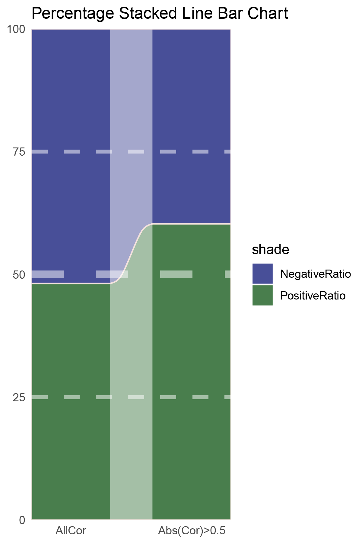
correlation_edgeR_ANKRD35_genecount_RATIO
NES_values <- edgeR_ANKRD35_hallmarks_y@result[ ,"NES"]
# Calculate the number of positive and negative values
positive_count <- sum(NES_values > 0)
negative_count <- sum(NES_values < 0)
# Print results
cat("Number of positive values:", positive_count, "\n")
cat("Number of negative values:", negative_count, "\n")

NES_values <- edgeR_ANKRD35_kegg_y@result[ ,"NES"]
# Calculate the number of positive and negative values
positive_count <- sum(NES_values > 0)
negative_count <- sum(NES_values < 0)
# Print results
cat("Number of positive values:", positive_count, "\n")
cat("Number of negative values:", negative_count, "\n")

data = tribble(
  ~Methods,  ~PositiveRatio,  ~NegativeRatio,
  "hallmarks_NES",  4,  1,
  "kegg_NES",  7,  0,
)
data %>%
  mutate(id = 1:n()) %>%
  pivot_longer(-c(id, Methods), names_to = "shade", values_to = "value") -> df

# Plotting
white_ratio <- 0.4
pal <- c('#1a237e', '#1b5e20')
pal <- as.vector(sapply(pal, add_white, white_ratio = white_ratio))
p16 <- df %>%
  mutate(prop = round(value/sum(value)*100, 2), .by = Methods) %>%
  ggplot(aes(x=id, y=prop, fill=shade)) +
  geom_stratum(aes(stratum=shade), color=NA, width = 0.65) +
  geom_flow(aes(alluvium=shade), knot.pos = 0.25, width = 0.65, alpha=0.5) +
  geom_alluvium(aes(alluvium=shade),
                knot.pos = 0.25, color="#f4e2de", width=0.65, linewidth=0.5, fill=NA, alpha=1) +
  scale_fill_manual(values = pal) +
  scale_x_continuous(expand = c(0, 0), breaks = 1:2, labels = data$Methods, name = NULL) +
  scale_y_continuous(expand = c(0, 0),
                      # limits = c(0, 10000),
                      name = NULL) +
  geom_hline(yintercept = c(50),
              linewidth = 3,
              color = 'white',
              lty = 'dashed',
              alpha = 0.5)+
  geom_hline(yintercept = c(25,75),
              linewidth = 1.5,
              color = 'white',
              lty = 'dashed',
              alpha = 0.5)+
  labs(title = "Percentage Stacked Line Bar Chart") +
  theme_minimal() +
  theme(plot.background = element_rect(fill='white', color='white'),
        panel.grid = element_blank())

p16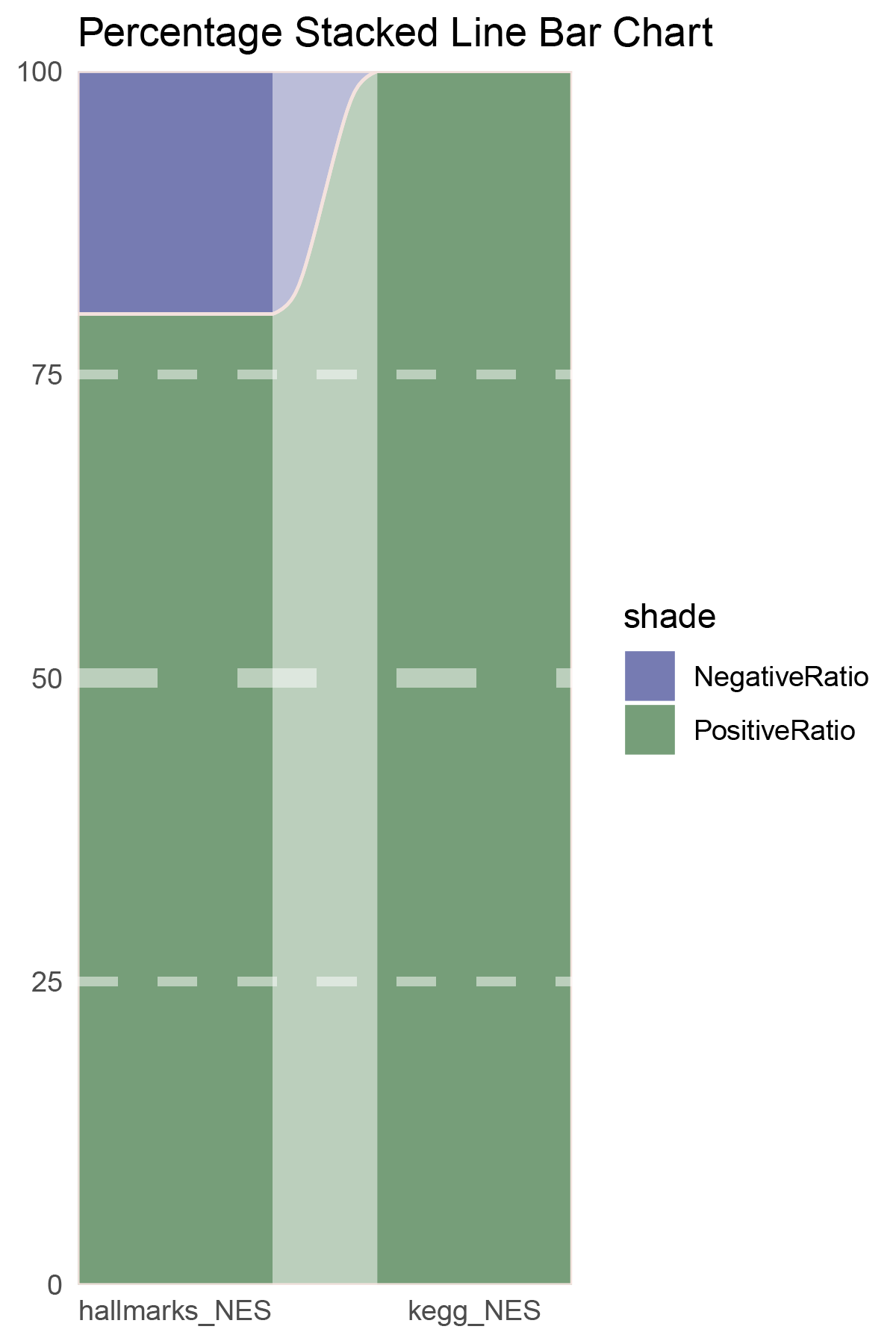
correlation_edgeR_ANKRD35_NES_RATIO
# Script for correlation_limma_ANKRD35
data <- correlation_limma_ANKRD35
total_positive <- sum(data$cor > 0)
total_negative <- sum(data$cor < 0)
positive_above_0_5 <- sum(data$cor > 0.5)
negative_below_minus_0_5 <- sum(data$cor < -0.5)
cat("correlation_limma_ANKRD35\n")
cat("Total positive correlations:", total_positive, "\n")
cat("Total negative correlations:", total_negative, "\n")
cat("Positive correlations above 0.5:", positive_above_0_5, "\n")
cat("Negative correlations below -0.5:", negative_below_minus_0_5, "\n\n")

data = tribble(
  ~Methods,  ~PositiveRatio,  ~NegativeRatio,
  "AllCor",  1455,  1180,
  "Abs(Cor)>0.5",  1307,  605,
)
data %>%
  mutate(id = 1:n()) %>%
  pivot_longer(-c(id, Methods), names_to = "shade", values_to = "value") -> df

# Plotting
# Add whiteness
white_ratio <- 0.2  # 20% white
# Define original colors
pal <- c('#0d47a1', '#33691e')
pal <- as.vector(sapply(pal, add_white, white_ratio = white_ratio))

p17 <- df %>%
  mutate(prop = round(value/sum(value)*100, 2), .by = Methods) %>%
  ggplot(aes(x=id, y=prop, fill=shade)) +
  geom_stratum(aes(stratum=shade), color=NA, width = 0.65) +
  geom_flow(aes(alluvium=shade), knot.pos = 0.25, width = 0.65, alpha=0.5) +
  geom_alluvium(aes(alluvium=shade),
                knot.pos = 0.25, color="#f4e2de", width=0.65, linewidth=0.5, fill=NA, alpha=1) +
  scale_fill_manual(values = pal) +
  scale_x_continuous(expand = c(0, 0), breaks = 1:2, labels = data$Methods, name = NULL) +
  scale_y_continuous(expand = c(0, 0),
                      # limits = c(0, 10000),
                      name = NULL) +
  geom_hline(yintercept = c(50),
              linewidth = 3,
              color = 'white',
              lty = 'dashed',
              alpha = 0.5)+
  geom_hline(yintercept = c(25,75),
              linewidth = 1.5,
              color = 'white',
              lty = 'dashed',
              alpha = 0.5)+
  labs(title = "Percentage Stacked Line Bar Chart") +
  theme_minimal() +
  theme(plot.background = element_rect(fill='white', color='white'),
        panel.grid = element_blank())
p17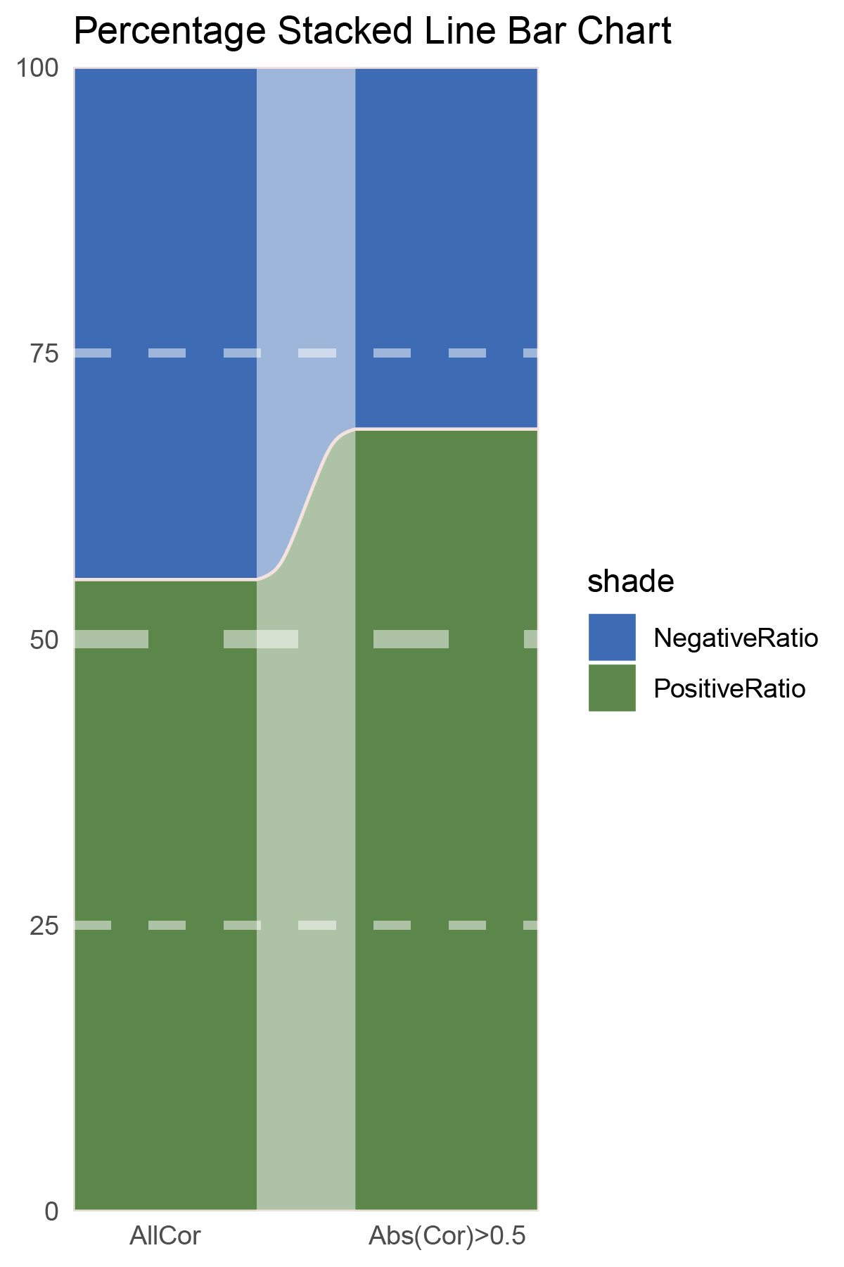
correlation_limma_ANKRD35_genecount_RATIO
NES_values <- limma_ANKRD35_hallmarks_y@result[ ,"NES"]
# Calculate the number of positive and negative values
positive_count <- sum(NES_values > 0)
negative_count <- sum(NES_values < 0)
# Print results
cat("Number of positive values:", positive_count, "\n")
cat("Number of negative values:", negative_count, "\n")

NES_values <- limma_ANKRD35_kegg_y@result[ ,"NES"]
# Calculate the number of positive and negative values
positive_count <- sum(NES_values > 0)
negative_count <- sum(NES_values < 0)
# Print results
cat("Number of positive values:", positive_count, "\n")
cat("Number of negative values:", negative_count, "\n")

data = tribble(
  ~Methods,  ~PositiveRatio,  ~NegativeRatio,
  "hallmarks_NES",  6,  10,
  "kegg_NES",  6,  15,
)
data %>%
  mutate(id = 1:n()) %>%
  pivot_longer(-c(id, Methods), names_to = "shade", values_to = "value") -> df

# Plotting
white_ratio <- 0.4
pal <- c('#0d47a1', '#33691e')
pal <- as.vector(sapply(pal, add_white, white_ratio = white_ratio))
p18 <- df %>%
  mutate(prop = round(value/sum(value)*100, 2), .by = Methods) %>%
  ggplot(aes(x=id, y=prop, fill=shade)) +
  geom_stratum(aes(stratum=shade), color=NA, width = 0.65) +
  geom_flow(aes(alluvium=shade), knot.pos = 0.25, width = 0.65, alpha=0.5) +
  geom_alluvium(aes(alluvium=shade),
                knot.pos = 0.25, color="#f4e2de", width=0.65, linewidth=0.5, fill=NA, alpha=1) +
  scale_fill_manual(values = pal) +
  scale_x_continuous(expand = c(0, 0), breaks = 1:2, labels = data$Methods, name = NULL) +
  scale_y_continuous(expand = c(0, 0),
                      # limits = c(0, 10000),
                      name = NULL) +
  geom_hline(yintercept = c(50),
              linewidth = 3,
              color = 'white',
              lty = 'dashed',
              alpha = 0.5)+
  geom_hline(yintercept = c(25,75),
              linewidth = 1.5,
              color = 'white',
              lty = 'dashed',
              alpha = 0.5)+
  labs(title = "Percentage Stacked Line Bar Chart") +
  theme_minimal() +
  theme(plot.background = element_rect(fill='white', color='white'),
        panel.grid = element_blank())

p18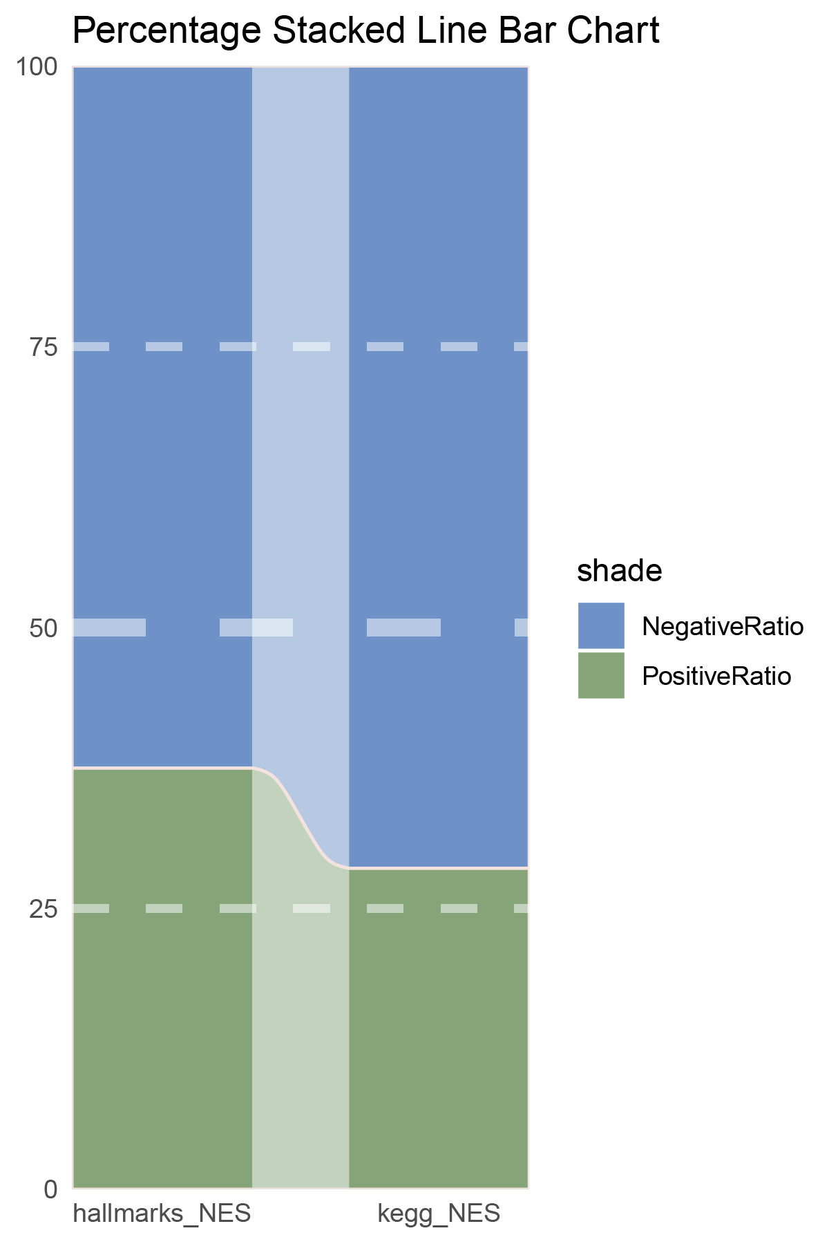
correlation_limma_ANKRD35_NES_RATIO
# Script for correlation_outRst_ANKRD35
data <- correlation_outRst_ANKRD35
total_positive <- sum(data$cor > 0)
total_negative <- sum(data$cor < 0)
positive_above_0_5 <- sum(data$cor > 0.5)
negative_below_minus_0_5 <- sum(data$cor < -0.5)
cat("correlation_outRst_ANKRD35\n")
cat("Total positive correlations:", total_positive, "\n")
cat("Total negative correlations:", total_negative, "\n")
cat("Positive correlations above 0.5:", positive_above_0_5, "\n")
cat("Negative correlations below -0.5:", negative_below_minus_0_5, "\n\n")

data = tribble(
  ~Methods,  ~PositiveRatio,  ~NegativeRatio,
  "AllCor",  1756,  879,
  "Abs(Cor)>0.5",  1518,  393,
)
data %>%
  mutate(id = 1:n()) %>%
  pivot_longer(-c(id, Methods), names_to = "shade", values_to = "value") -> df

# Plotting
# Add whiteness
white_ratio <- 0.2  # 20% white
# Define original colors
pal <- c('#01579b', '#827717')
pal <- as.vector(sapply(pal, add_white, white_ratio = white_ratio))

p19 <- df %>%
  mutate(prop = round(value/sum(value)*100, 2), .by = Methods) %>%
  ggplot(aes(x=id, y=prop, fill=shade)) +
  geom_stratum(aes(stratum=shade), color=NA, width = 0.65) +
  geom_flow(aes(alluvium=shade), knot.pos = 0.25, width = 0.65, alpha=0.5) +
  geom_alluvium(aes(alluvium=shade),
                knot.pos = 0.25, color="#f4e2de", width=0.65, linewidth=0.5, fill=NA, alpha=1) +
  scale_fill_manual(values = pal) +
  scale_x_continuous(expand = c(0, 0), breaks = 1:2, labels = data$Methods, name = NULL) +
  scale_y_continuous(expand = c(0, 0),
                      # limits = c(0, 10000),
                      name = NULL) +
  geom_hline(yintercept = c(50),
              linewidth = 3,
              color = 'white',
              lty = 'dashed',
              alpha = 0.5)+
  geom_hline(yintercept = c(25,75),
              linewidth = 1.5,
              color = 'white',
              lty = 'dashed',
              alpha = 0.5)+
  labs(title = "Percentage Stacked Line Bar Chart") +
  theme_minimal() +
  theme(plot.background = element_rect(fill='white', color='white'),
        panel.grid = element_blank())
p19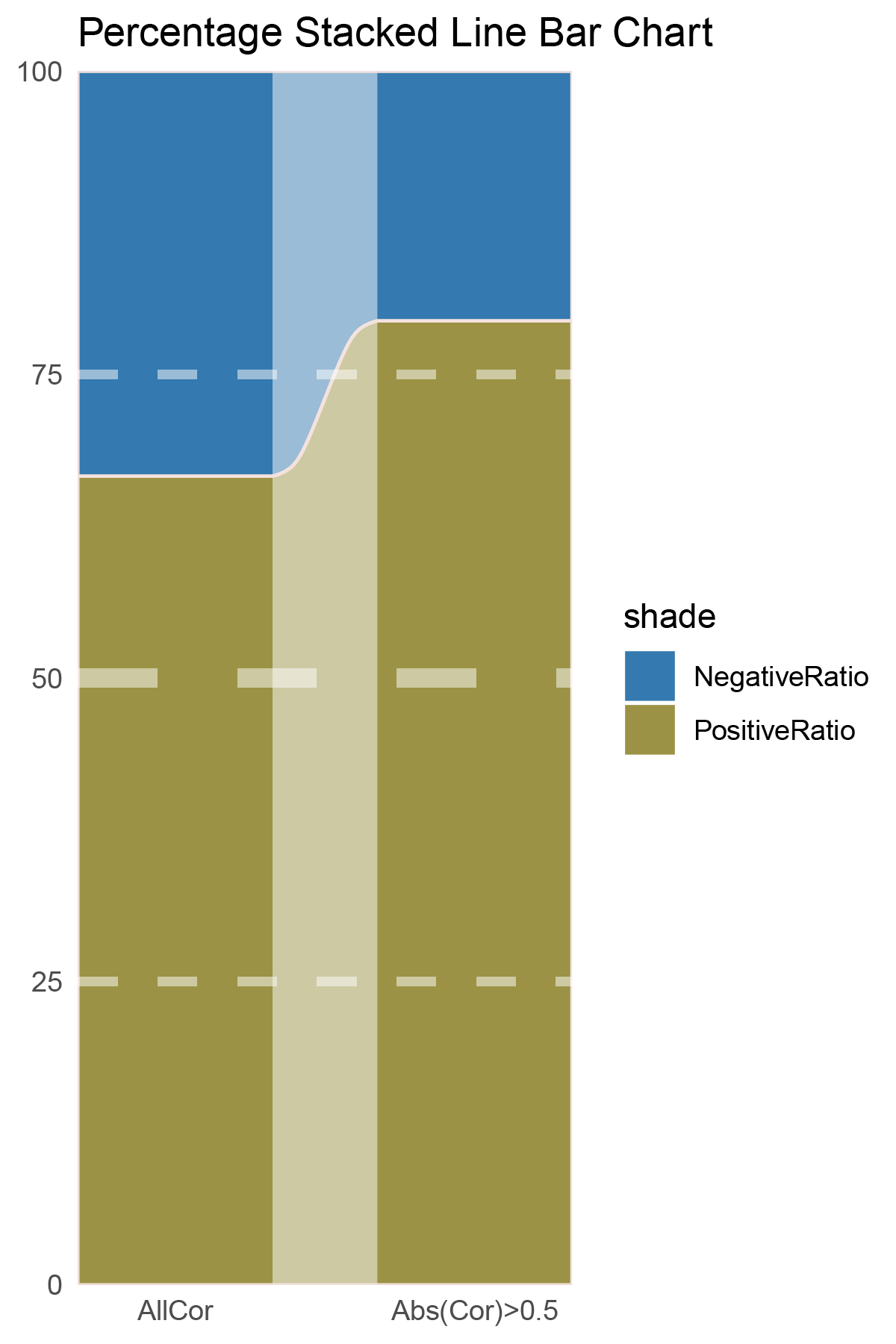
correlation_outRst_ANKRD35_genecount_RATIO
NES_values <- outRst_ANKRD35_hallmarks_y@result[ ,"NES"]
# Calculate the number of positive and negative values
positive_count <- sum(NES_values > 0)
negative_count <- sum(NES_values < 0)
# Print results
cat("Number of positive values:", positive_count, "\n")
cat("Number of negative values:", negative_count, "\n")

NES_values <- outRst_ANKRD35_kegg_y@result[ ,"NES"]
# Calculate the number of positive and negative values
positive_count <- sum(NES_values > 0)
negative_count <- sum(NES_values < 0)
# Print results
cat("Number of positive values:", positive_count, "\n")
cat("Number of negative values:", negative_count, "\n")

data = tribble(
  ~Methods,  ~PositiveRatio,  ~NegativeRatio,
  "hallmarks_NES",  4,  8,
  "kegg_NES",  3,  14,
)
data %>%
  mutate(id = 1:n()) %>%
  pivot_longer(-c(id, Methods), names_to = "shade", values_to = "value") -> df

# Plotting
white_ratio <- 0.4
pal <- c('#01579b', '#827717')
pal <- as.vector(sapply(pal, add_white, white_ratio = white_ratio))
p20 <- df %>%
  mutate(prop = round(value/sum(value)*100, 2), .by = Methods) %>%
  ggplot(aes(x=id, y=prop, fill=shade)) +
  geom_stratum(aes(stratum=shade), color=NA, width = 0.65) +
  geom_flow(aes(alluvium=shade), knot.pos = 0.25, width = 0.65, alpha=0.5) +
  geom_alluvium(aes(alluvium=shade),
                knot.pos = 0.25, color="#f4e2de", width=0.65, linewidth=0.5, fill=NA, alpha=1) +
  scale_fill_manual(values = pal) +
  scale_x_continuous(expand = c(0, 0), breaks = 1:2, labels = data$Methods, name = NULL) +
  scale_y_continuous(expand = c(0, 0),
                      # limits = c(0, 10000),
                      name = NULL) +
  geom_hline(yintercept = c(50),
              linewidth = 3,
              color = 'white',
              lty = 'dashed',
              alpha = 0.5)+
  geom_hline(yintercept = c(25,75),
              linewidth = 1.5,
              color = 'white',
              lty = 'dashed',
              alpha = 0.5)+
  labs(title = "Percentage Stacked Line Bar Chart") +
  theme_minimal() +
  theme(plot.background = element_rect(fill='white', color='white'),
        panel.grid = element_blank())

p20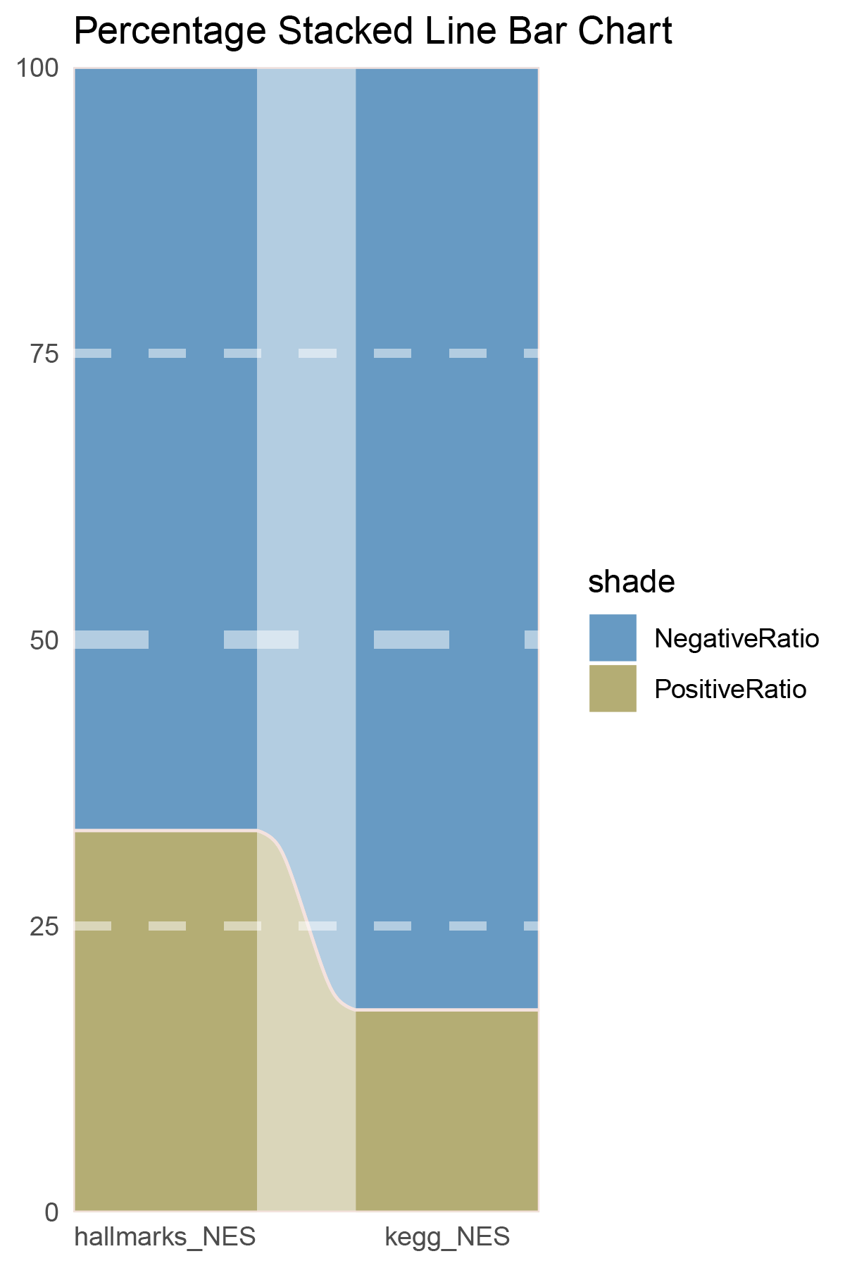
correlation_outRst_ANKRD35_NES_RATIO
15.3.1 ANKRD35_ALL
ANKRD35_ALL_RATIO
15.3.2 ANKRD35_seprate
ANKRD35_seprate_RATIO
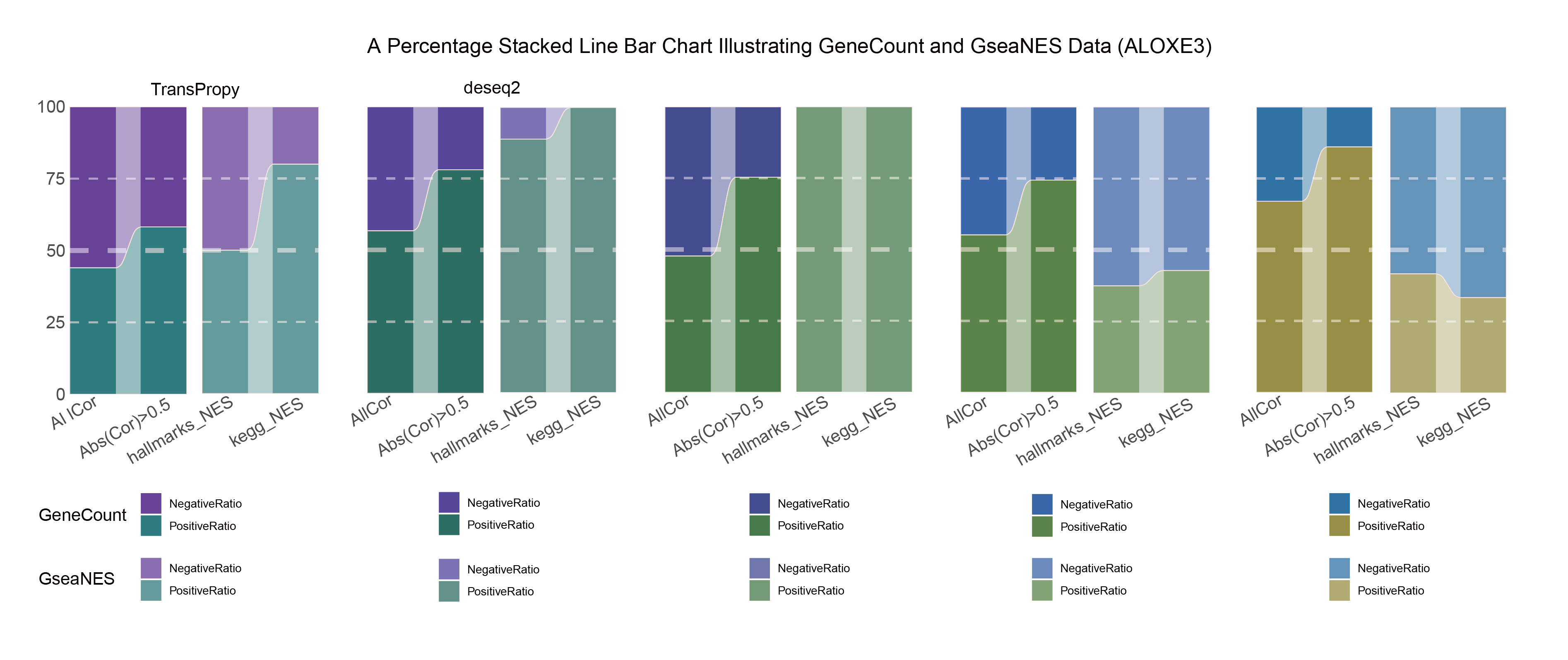
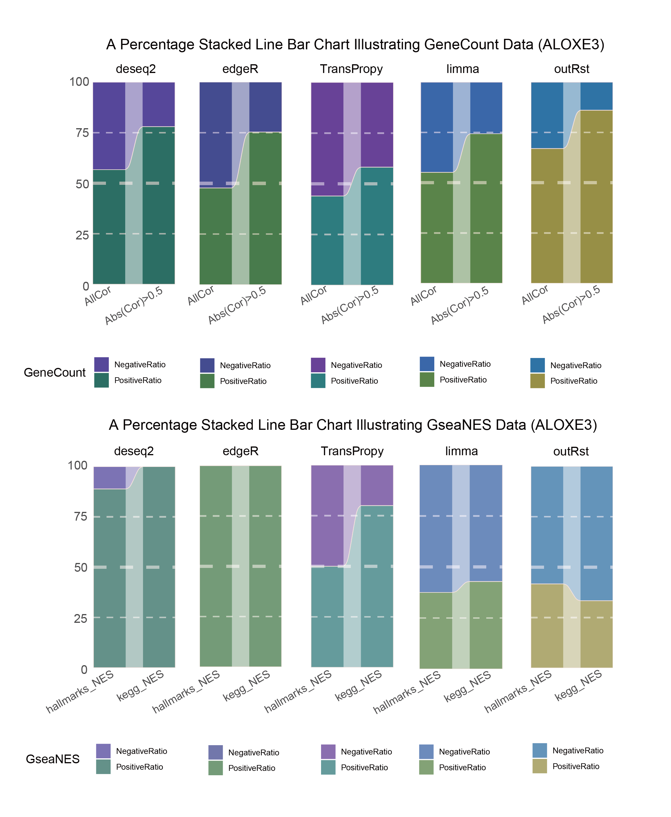
15.4 ALOXE3
# Script for correlation_TransPropy_ALOXE3
data <- correlation_TransPropy_ALOXE3
total_positive <- sum(data$cor > 0)
total_negative <- sum(data$cor < 0)
positive_above_0_5 <- sum(data$cor > 0.5)
negative_below_minus_0_5 <- sum(data$cor < -0.5)
cat("correlation_TransPropy_ALOXE3\n")
cat("Total positive correlations:", total_positive, "\n")
cat("Total negative correlations:", total_negative, "\n")
cat("Positive correlations above 0.5:", positive_above_0_5, "\n")
cat("Negative correlations below -0.5:", negative_below_minus_0_5, "\n\n")

data = tribble(
  ~Methods,  ~PositiveRatio,  ~NegativeRatio,
  "AllCor",  1159,  1476,
  "Abs(Cor)>0.5",  699,  502,
)

data %>%
  mutate(id = 1:n()) %>%
  pivot_longer(-c(id, Methods), names_to = "shade", values_to = "value") -> df

# Plotting
# Add whiteness
white_ratio <- 0.2  # 20% white
# Define original colors
pal <- c('#4a148c', '#006064')
pal <- as.vector(sapply(pal, add_white, white_ratio = white_ratio))

p21<- df %>%
  mutate(prop = round(value/sum(value)*100, 2), .by = Methods) %>%
  ggplot(aes(x=id, y=prop, fill=shade)) +
  geom_stratum(aes(stratum=shade), color=NA, width = 0.65) +
  geom_flow(aes(alluvium=shade), knot.pos = 0.25, width = 0.65, alpha=0.5) +
  geom_alluvium(aes(alluvium=shade),
                knot.pos = 0.25, color="#f4e2de", width=0.65, linewidth=0.5, fill=NA, alpha=1) +
  scale_fill_manual(values = pal) +
  scale_x_continuous(expand = c(0, 0), breaks = 1:2, labels = data$Methods, name = NULL) +
  scale_y_continuous(expand = c(0, 0),
                      name = NULL) +
  geom_hline(yintercept = c(50),
              linewidth = 3,
              color = 'white',
              lty = 'dashed',
              alpha = 0.5)+
  geom_hline(yintercept = c(25,75),
              linewidth = 1.5,
              color = 'white',
              lty = 'dashed',
              alpha = 0.5)+
  labs(title = "Percentage Stacked Line Bar Chart") +
  theme_minimal() +
  theme(plot.background = element_rect(fill='white', color='white'),
        panel.grid = element_blank())

p21![]()
correlation_TransPropy_ALOXE3_genecount_RATIO
NES_values <- TransPropy_ALOXE3_hallmarks_y@result[ ,"NES"]
# Calculate the number of positive and negative values
positive_count <- sum(NES_values > 0)
negative_count <- sum(NES_values < 0)
# Print results
cat("Number of positive values:", positive_count, "\n")
cat("Number of negative values:", negative_count, "\n")

NES_values <- TransPropy_ALOXE3_kegg_y@result[ ,"NES"]
# Calculate the number of positive and negative values
positive_count <- sum(NES_values > 0)
negative_count <- sum(NES_values < 0)
# Print results
cat("Number of positive values:", positive_count, "\n")
cat("Number of negative values:", negative_count, "\n")

data = tribble(
  ~Methods,  ~PositiveRatio,  ~NegativeRatio,
  "hallmarks_NES",  5,  5,
  "kegg_NES",  8,  2,
)
data %>%
  mutate(id = 1:n()) %>%
  pivot_longer(-c(id, Methods), names_to = "shade", values_to = "value") -> df

# Plotting
white_ratio <- 0.4
pal <- c('#4a148c', '#006064')
pal <- as.vector(sapply(pal, add_white, white_ratio = white_ratio))
p22 <- df %>%
  mutate(prop = round(value/sum(value)*100, 2), .by = Methods) %>%
  ggplot(aes(x=id, y=prop, fill=shade)) +
  geom_stratum(aes(stratum=shade), color=NA, width = 0.65) +
  geom_flow(aes(alluvium=shade), knot.pos = 0.25, width = 0.65, alpha=0.5) +
  geom_alluvium(aes(alluvium=shade),
                knot.pos = 0.25, color="#f4e2de", width=0.65, linewidth=0.5, fill=NA, alpha=1) +
  scale_fill_manual(values = pal) +
  scale_x_continuous(expand = c(0, 0), breaks = 1:2, labels = data$Methods, name = NULL) +
  scale_y_continuous(expand = c(0, 0),
                      name = NULL) +
  geom_hline(yintercept = c(50),
              linewidth = 3,
              color = 'white',
              lty = 'dashed',
              alpha = 0.5)+
  geom_hline(yintercept = c(25,75),
              linewidth = 1.5,
              color = 'white',
              lty = 'dashed',
              alpha = 0.5)+
  labs(title = "Percentage Stacked Line Bar Chart") +
  theme_minimal() +
  theme(plot.background = element_rect(fill='white', color='white'),
        panel.grid = element_blank())

p22![]()
correlation_TransPropy_ALOXE3_NES_RATIO
# Script for correlation_deseq2_ALOXE3
data <- correlation_deseq2_ALOXE3
total_positive <- sum(data$cor > 0)
total_negative <- sum(data$cor < 0)
positive_above_0_5 <- sum(data$cor > 0.5)
negative_below_minus_0_5 <- sum(data$cor < -0.5)
cat("correlation_deseq2_ALOXE3\n")
cat("Total positive correlations:", total_positive, "\n")
cat("Total negative correlations:", total_negative, "\n")
cat("Positive correlations above 0.5:", positive_above_0_5, "\n")
cat("Negative correlations below -0.5:", negative_below_minus_0_5, "\n\n")

data = tribble(
  ~Methods,  ~PositiveRatio,  ~NegativeRatio,
  "AllCor",  1495,  1140,
  "Abs(Cor)>0.5",  1035,  292,
)
data %>%
  mutate(id = 1:n()) %>%
  pivot_longer(-c(id, Methods), names_to = "shade", values_to = "value") -> df

# Plotting
# Add whiteness
white_ratio <- 0.2  # 20% white
# Define original colors
pal <- c('#311b92', '#004d40')
pal <- as.vector(sapply(pal, add_white, white_ratio = white_ratio))

p23 <- df %>%
  mutate(prop = round(value/sum(value)*100, 2), .by = Methods) %>%
  ggplot(aes(x=id, y=prop, fill=shade)) +
  geom_stratum(aes(stratum=shade), color=NA, width = 0.65) +
  geom_flow(aes(alluvium=shade), knot.pos = 0.25, width = 0.65, alpha=0.5) +
  geom_alluvium(aes(alluvium=shade),
                knot.pos = 0.25, color="#f4e2de", width=0.65, linewidth=0.5, fill=NA, alpha=1) +
  scale_fill_manual(values = pal) +
  scale_x_continuous(expand = c(0, 0), breaks = 1:2, labels = data$Methods, name = NULL) +
  scale_y_continuous(expand = c(0, 0),
                      name = NULL) +
  geom_hline(yintercept = c(50),
              linewidth = 3,
              color = 'white',
              lty = 'dashed',
              alpha = 0.5)+
  geom_hline(yintercept = c(25,75),
              linewidth = 1.5,
              color = 'white',
              lty = 'dashed',
              alpha = 0.5)+
  labs(title = "Percentage Stacked Line Bar Chart") +
  theme_minimal() +
  theme(plot.background = element_rect(fill='white', color='white'),
        panel.grid = element_blank())
p23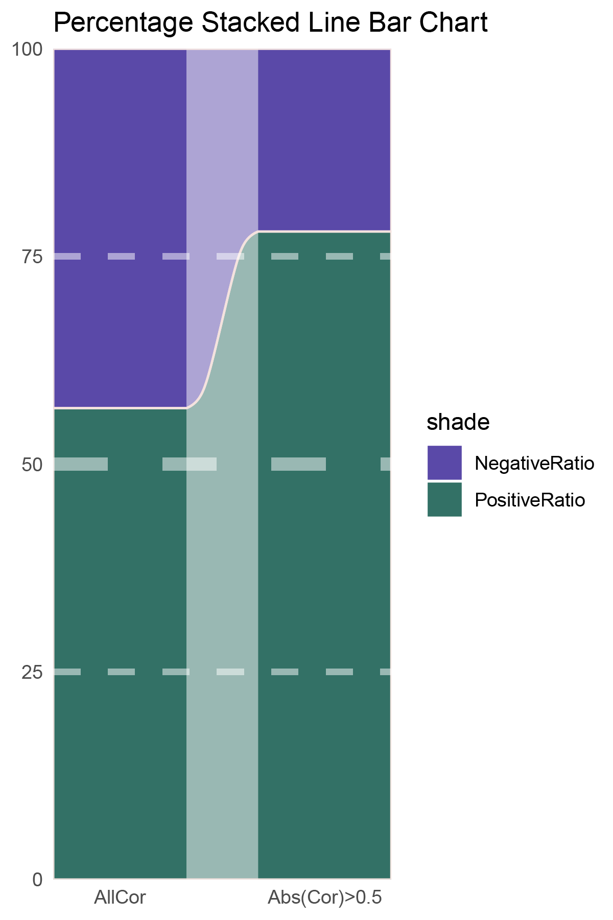
correlation_deseq2_ALOXE3_genecount_RATIO
NES_values <- deseq2_ALOXE3_hallmarks_y@result[ ,"NES"]
# Calculate the number of positive and negative values
positive_count <- sum(NES_values > 0)
negative_count <- sum(NES_values < 0)
# Print results
cat("Number of positive values:", positive_count, "\n")
cat("Number of negative values:", negative_count, "\n")

NES_values <- deseq2_ALOXE3_kegg_y@result[ ,"NES"]
# Calculate the number of positive and negative values
positive_count <- sum(NES_values > 0)
negative_count <- sum(NES_values < 0)
# Print results
cat("Number of positive values:", positive_count, "\n")
cat("Number of negative values:", negative_count, "\n")

data = tribble(
  ~Methods,  ~PositiveRatio,  ~NegativeRatio,
  "hallmarks_NES",  8,  1,
  "kegg_NES",  9,  0,
)
data %>%
  mutate(id = 1:n()) %>%
  pivot_longer(-c(id, Methods), names_to = "shade", values_to = "value") -> df

# Plotting
white_ratio <- 0.4
pal <- c('#311b92', '#004d40')
pal <- as.vector(sapply(pal, add_white, white_ratio = white_ratio))
p24 <- df %>%
  mutate(prop = round(value/sum(value)*100, 2), .by = Methods) %>%
  ggplot(aes(x=id, y=prop, fill=shade)) +
  geom_stratum(aes(stratum=shade), color=NA, width = 0.65) +
  geom_flow(aes(alluvium=shade), knot.pos = 0.25, width = 0.65, alpha=0.5) +
  geom_alluvium(aes(alluvium=shade),
                knot.pos = 0.25, color="#f4e2de", width=0.65, linewidth=0.5, fill=NA, alpha=1) +
  scale_fill_manual(values = pal) +
  scale_x_continuous(expand = c(0, 0), breaks = 1:2, labels = data$Methods, name = NULL) +
  scale_y_continuous(expand = c(0, 0),
                      name = NULL) +
  geom_hline(yintercept = c(50),
              linewidth = 3,
              color = 'white',
              lty = 'dashed',
              alpha = 0.5)+
  geom_hline(yintercept = c(25,75),
              linewidth = 1.5,
              color = 'white',
              lty = 'dashed',
              alpha = 0.5)+
  labs(title = "Percentage Stacked Line Bar Chart") +
  theme_minimal() +
  theme(plot.background = element_rect(fill='white', color='white'),
        panel.grid = element_blank())

p24
correlation_deseq2_ALOXE3_NES_RATIO
# Script for correlation_edgeR_ALOXE3
data <- correlation_edgeR_ALOXE3
total_positive <- sum(data$cor > 0)
total_negative <- sum(data$cor < 0)
positive_above_0_5 <- sum(data$cor > 0.5)
negative_below_minus_0_5 <- sum(data$cor < -0.5)
cat("correlation_edgeR_ALOXE3\n")
cat("Total positive correlations:", total_positive, "\n")
cat("Total negative correlations:", total_negative, "\n")
cat("Positive correlations above 0.5:", positive_above_0_5, "\n")
cat("Negative correlations below -0.5:", negative_below_minus_0_5, "\n\n")

data = tribble(
  ~Methods,  ~PositiveRatio,  ~NegativeRatio,
  "AllCor",  1258,  1377,
  "Abs(Cor)>0.5",  861,  282,
)
data %>%
  mutate(id = 1:n()) %>%
  pivot_longer(-c(id, Methods), names_to = "shade", values_to = "value") -> df

# Plotting
# Add whiteness
white_ratio <- 0.2  # 20% white
# Define original colors
pal <- c('#1a237e', '#1b5e20')
pal <- as.vector(sapply(pal, add_white, white_ratio = white_ratio))

p25 <- df %>%
  mutate(prop = round(value/sum(value)*100, 2), .by = Methods) %>%
  ggplot(aes(x=id, y=prop, fill=shade)) +
  geom_stratum(aes(stratum=shade), color=NA, width = 0.65) +
  geom_flow(aes(alluvium=shade), knot.pos = 0.25, width = 0.65, alpha=0.5) +
  geom_alluvium(aes(alluvium=shade),
                knot.pos = 0.25, color="#f4e2de", width=0.65, linewidth=0.5, fill=NA, alpha=1) +
  scale_fill_manual(values = pal) +
  scale_x_continuous(expand = c(0, 0), breaks = 1:2, labels = data$Methods, name = NULL) +
  scale_y_continuous(expand = c(0, 0),
                      name = NULL) +
  geom_hline(yintercept = c(50),
              linewidth = 3,
              color = 'white',
              lty = 'dashed',
              alpha = 0.5)+
  geom_hline(yintercept = c(25,75),
              linewidth = 1.5,
              color = 'white',
              lty = 'dashed',
              alpha = 0.5)+
  labs(title = "Percentage Stacked Line Bar Chart") +
  theme_minimal() +
  theme(plot.background = element_rect(fill='white', color='white'),
        panel.grid = element_blank())
p25
correlation_edgeR_ALOXE3_genecount_RATIO
NES_values <- edgeR_ALOXE3_hallmarks_y@result[ ,"NES"]
# Calculate the number of positive and negative values
positive_count <- sum(NES_values > 0)
negative_count <- sum(NES_values < 0)
# Print results
cat("Number of positive values:", positive_count, "\n")
cat("Number of negative values:", negative_count, "\n")

NES_values <- edgeR_ALOXE3_kegg_y@result[ ,"NES"]
# Calculate the number of positive and negative values
positive_count <- sum(NES_values > 0)
negative_count <- sum(NES_values < 0)
# Print results
cat("Number of positive values:", positive_count, "\n")
cat("Number of negative values:", negative_count, "\n")

data = tribble(
  ~Methods,  ~PositiveRatio,  ~NegativeRatio,
  "hallmarks_NES",  4,  0,
  "kegg_NES",  7,  0,
)
data %>%
  mutate(id = 1:n()) %>%
  pivot_longer(-c(id, Methods), names_to = "shade", values_to = "value") -> df

# Plotting
white_ratio <- 0.4
pal <- c('#1a237e', '#1b5e20')
pal <- as.vector(sapply(pal, add_white, white_ratio = white_ratio))
p26 <- df %>%
  mutate(prop = round(value/sum(value)*100, 2), .by = Methods) %>%
  ggplot(aes(x=id, y=prop, fill=shade)) +
  geom_stratum(aes(stratum=shade), color=NA, width = 0.65) +
  geom_flow(aes(alluvium=shade), knot.pos = 0.25, width = 0.65, alpha=0.5) +
  geom_alluvium(aes(alluvium=shade),
                knot.pos = 0.25, color="#f4e2de", width=0.65, linewidth=0.5, fill=NA, alpha=1) +
  scale_fill_manual(values = pal) +
  scale_x_continuous(expand = c(0, 0), breaks = 1:2, labels = data$Methods, name = NULL) +
  scale_y_continuous(expand = c(0, 0),
                      name = NULL) +
  geom_hline(yintercept = c(50),
              linewidth = 3,
              color = 'white',
              lty = 'dashed',
              alpha = 0.5)+
  geom_hline(yintercept = c(25,75),
              linewidth = 1.5,
              color = 'white',
              lty = 'dashed',
              alpha = 0.5)+
  labs(title = "Percentage Stacked Line Bar Chart") +
  theme_minimal() +
  theme(plot.background = element_rect(fill='white', color='white'),
        panel.grid = element_blank())

p26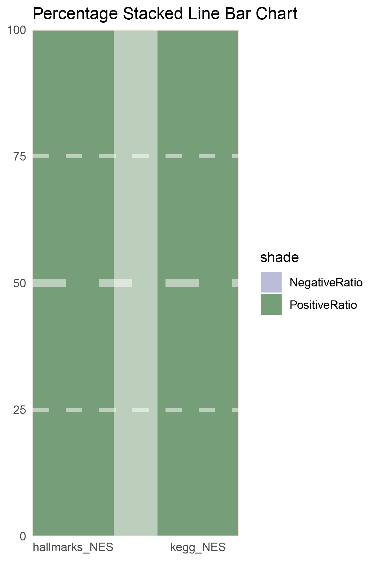
correlation_edgeR_ALOXE3_NES_RATIO
# Script for correlation_limma_ALOXE3
data <- correlation_limma_ALOXE3
total_positive <- sum(data$cor > 0)
total_negative <- sum(data$cor < 0)
positive_above_0_5 <- sum(data$cor > 0.5)
negative_below_minus_0_5 <- sum(data$cor < -0.5)
cat("correlation_limma_ALOXE3\n")
cat("Total positive correlations:", total_positive, "\n")
cat("Total negative correlations:", total_negative, "\n")
cat("Positive correlations above 0.5:", positive_above_0_5, "\n")
cat("Negative correlations below -0.5:", negative_below_minus_0_5, "\n\n")

data = tribble(
  ~Methods,  ~PositiveRatio,  ~NegativeRatio,
  "AllCor",  1454,  1181,
  "Abs(Cor)>0.5",  1129,  389,
)
data %>%
  mutate(id = 1:n()) %>%
  pivot_longer(-c(id, Methods), names_to = "shade", values_to = "value") -> df

# Plotting
# Add whiteness
white_ratio <- 0.2  # 20% white
# Define original colors
pal <- c('#0d47a1', '#33691e')
pal <- as.vector(sapply(pal, add_white, white_ratio = white_ratio))

p27 <- df %>%
  mutate(prop = round(value/sum(value)*100, 2), .by = Methods) %>%
  ggplot(aes(x=id, y=prop, fill=shade)) +
  geom_stratum(aes(stratum=shade), color=NA, width = 0.65) +
  geom_flow(aes(alluvium=shade), knot.pos = 0.25, width = 0.65, alpha=0.5) +
  geom_alluvium(aes(alluvium=shade),
                knot.pos = 0.25, color="#f4e2de", width=0.65, linewidth=0.5, fill=NA, alpha=1) +
  scale_fill_manual(values = pal) +
  scale_x_continuous(expand = c(0, 0), breaks = 1:2, labels = data$Methods, name = NULL) +
  scale_y_continuous(expand = c(0, 0),
                      name = NULL) +
  geom_hline(yintercept = c(50),
              linewidth = 3,
              color = 'white',
              lty = 'dashed',
              alpha = 0.5)+
  geom_hline(yintercept = c(25,75),
              linewidth = 1.5,
              color = 'white',
              lty = 'dashed',
              alpha = 0.5)+
  labs(title = "Percentage Stacked Line Bar Chart") +
  theme_minimal() +
  theme(plot.background = element_rect(fill='white', color='white'),
        panel.grid = element_blank())
p27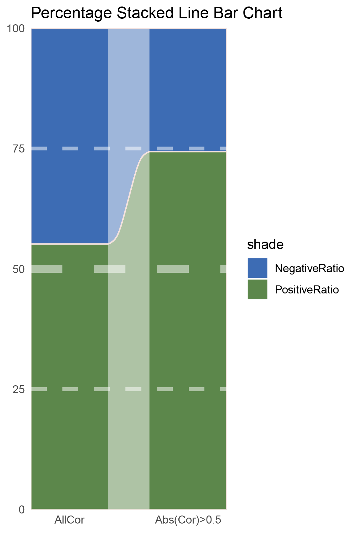
correlation_limma_ALOXE3_genecount_RATIO
NES_values <- limma_ALOXE3_hallmarks_y@result[ ,"NES"]
# Calculate the number of positive and negative values
positive_count <- sum(NES_values > 0)
negative_count <- sum(NES_values < 0)
# Print results
cat("Number of positive values:", positive_count, "\n")
cat("Number of negative values:", negative_count, "\n")

NES_values <- limma_ALOXE3_kegg_y@result[ ,"NES"]
# Calculate the number of positive and negative values
positive_count <- sum(NES_values > 0)
negative_count <- sum(NES_values < 0)
# Print results
cat("Number of positive values:", positive_count, "\n")
cat("Number of negative values:", negative_count, "\n")

data = tribble(
  ~Methods,  ~PositiveRatio,  ~NegativeRatio,
  "hallmarks_NES",  6,  10,
  "kegg_NES",  6,  8,
)
data %>%
  mutate(id = 1:n()) %>%
  pivot_longer(-c(id, Methods), names_to = "shade", values_to = "value") -> df

# Plotting
white_ratio <- 0.4
pal <- c('#0d47a1', '#33691e')
pal <- as.vector(sapply(pal, add_white, white_ratio = white_ratio))
p28 <- df %>%
  mutate(prop = round(value/sum(value)*100, 2), .by = Methods) %>%
  ggplot(aes(x=id, y=prop, fill=shade)) +
  geom_stratum(aes(stratum=shade), color=NA, width = 0.65) +
  geom_flow(aes(alluvium=shade), knot.pos = 0.25, width = 0.65, alpha=0.5) +
  geom_alluvium(aes(alluvium=shade),
                knot.pos = 0.25, color="#f4e2de", width=0.65, linewidth=0.5, fill=NA, alpha=1) +
  scale_fill_manual(values = pal) +
  scale_x_continuous(expand = c(0, 0), breaks = 1:2, labels = data$Methods, name = NULL) +
  scale_y_continuous(expand = c(0, 0),
                      name = NULL) +
  geom_hline(yintercept = c(50),
              linewidth = 3,
              color = 'white',
              lty = 'dashed',
              alpha = 0.5)+
  geom_hline(yintercept = c(25,75),
              linewidth = 1.5,
              color = 'white',
              lty = 'dashed',
              alpha = 0.5)+
  labs(title = "Percentage Stacked Line Bar Chart") +
  theme_minimal() +
  theme(plot.background = element_rect(fill='white', color='white'),
        panel.grid = element_blank())

p28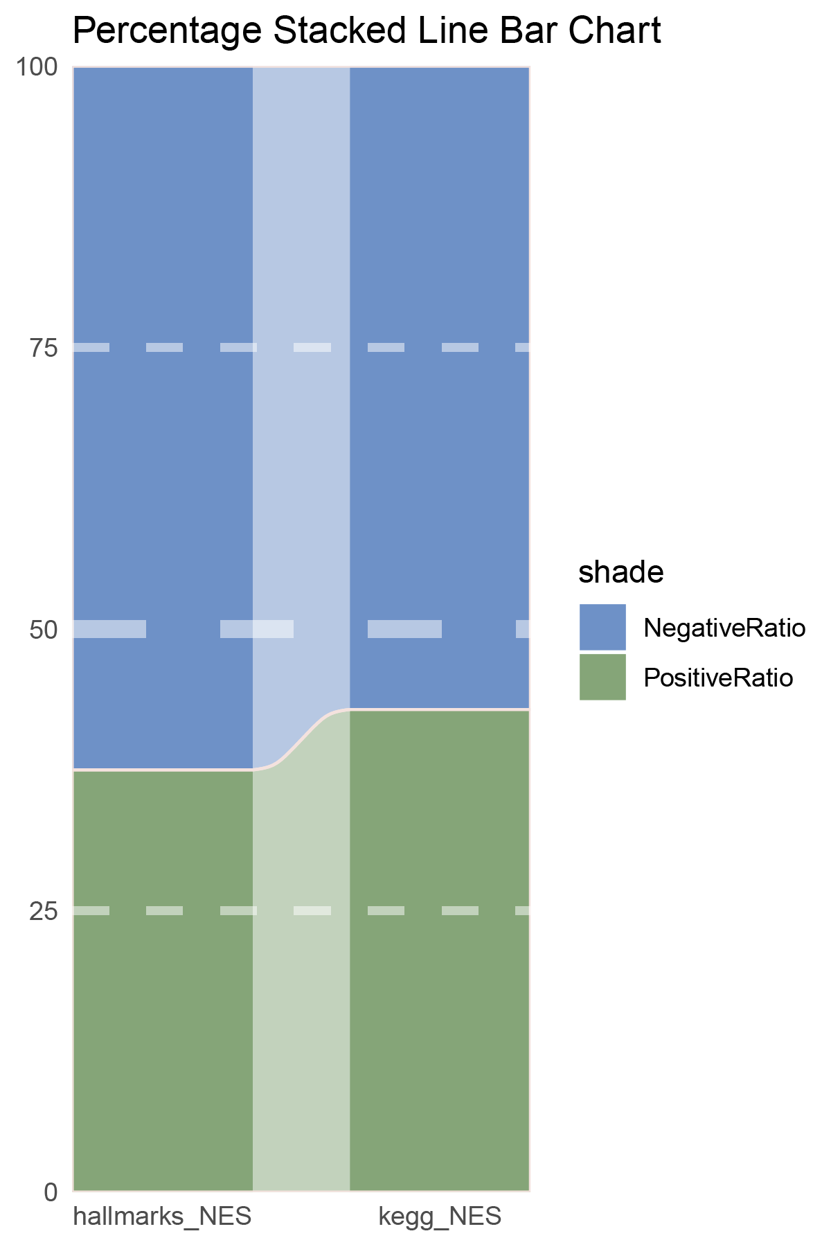
correlation_limma_ALOXE3_NES_RATIO
# Script for correlation_outRst_ALOXE3
data <- correlation_outRst_ALOXE3
total_positive <- sum(data$cor > 0)
total_negative <- sum(data$cor < 0)
positive_above_0_5 <- sum(data$cor > 0.5)
negative_below_minus_0_5 <- sum(data$cor < -0.5)
cat("correlation_outRst_ALOXE3\n")
cat("Total positive correlations:", total_positive, "\n")
cat("Total negative correlations:", total_negative, "\n")
cat("Positive correlations above 0.5:", positive_above_0_5, "\n")
cat("Negative correlations below -0.5:", negative_below_minus_0_5, "\n\n")

data = tribble(
  ~Methods,  ~PositiveRatio,  ~NegativeRatio,
  "AllCor",  1765,  870,
  "Abs(Cor)>0.5",  1345,  218,
)
data %>%
  mutate(id = 1:n()) %>%
  pivot_longer(-c(id, Methods), names_to = "shade", values_to = "value") -> df

# Plotting
# Add whiteness
white_ratio <- 0.2  # 20% white
# Define original colors
pal <- c('#01579b', '#827717')
pal <- as.vector(sapply(pal, add_white, white_ratio = white_ratio))

p29 <- df %>%
  mutate(prop = round(value/sum(value)*100, 2), .by = Methods) %>%
  ggplot(aes(x=id, y=prop, fill=shade)) +
  geom_stratum(aes(stratum=shade), color=NA, width = 0.65) +
  geom_flow(aes(alluvium=shade), knot.pos = 0.25, width = 0.65, alpha=0.5) +
  geom_alluvium(aes(alluvium=shade),
                knot.pos = 0.25, color="#f4e2de", width=0.65, linewidth=0.5, fill=NA, alpha=1) +
  scale_fill_manual(values = pal) +
  scale_x_continuous(expand = c(0, 0), breaks = 1:2, labels = data$Methods, name = NULL) +
  scale_y_continuous(expand = c(0, 0),
                      name = NULL) +
  geom_hline(yintercept = c(50),
              linewidth = 3,
              color = 'white',
              lty = 'dashed',
              alpha = 0.5)+
  geom_hline(yintercept = c(25,75),
              linewidth = 1.5,
              color = 'white',
              lty = 'dashed',
              alpha = 0.5)+
  labs(title = "Percentage Stacked Line Bar Chart") +
  theme_minimal() +
  theme(plot.background = element_rect(fill='white', color='white'),
        panel.grid = element_blank())
p29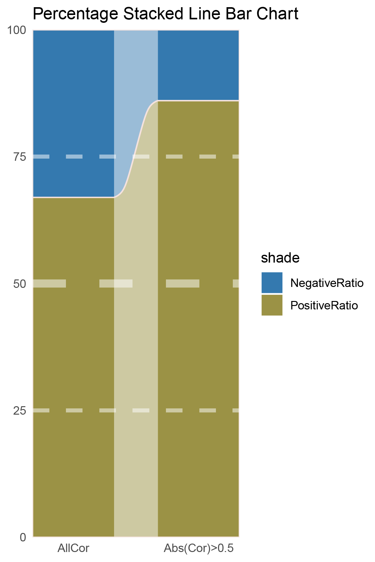
correlation_outRst_ALOXE3_genecount_RATIO
NES_values <- outRst_ALOXE3_hallmarks_y@result[ ,"NES"]
# Calculate the number of positive and negative values
positive_count <- sum(NES_values > 0)
negative_count <- sum(NES_values < 0)
# Print results
cat("Number of positive values:", positive_count, "\n")
cat("Number of negative values:", negative_count, "\n")

NES_values <- outRst_ALOXE3_kegg_y@result[ ,"NES"]
# Calculate the number of positive and negative values
positive_count <- sum(NES_values > 0)
negative_count <- sum(NES_values < 0)
# Print results
cat("Number of positive values:", positive_count, "\n")
cat("Number of negative values:", negative_count, "\n")

data = tribble(
  ~Methods,  ~PositiveRatio,  ~NegativeRatio,
  "hallmarks_NES",  5,  7,
  "kegg_NES",  7,  14,
)
data %>%
  mutate(id = 1:n()) %>%
  pivot_longer(-c(id, Methods), names_to = "shade", values_to = "value") -> df

# Plotting
white_ratio <- 0.4
pal <- c('#01579b', '#827717')
pal <- as.vector(sapply(pal, add_white, white_ratio = white_ratio))
p30 <- df %>%
  mutate(prop = round(value/sum(value)*100, 2), .by = Methods) %>%
  ggplot(aes(x=id, y=prop, fill=shade)) +
  geom_stratum(aes(stratum=shade), color=NA, width = 0.65) +
  geom_flow(aes(alluvium=shade), knot.pos = 0.25, width = 0.65, alpha=0.5) +
  geom_alluvium(aes(alluvium=shade),
                knot.pos = 0.25, color="#f4e2de", width=0.65, linewidth=0.5, fill=NA, alpha=1) +
  scale_fill_manual(values = pal) +
  scale_x_continuous(expand = c(0, 0), breaks = 1:2, labels = data$Methods, name = NULL) +
  scale_y_continuous(expand = c(0, 0),
                      name = NULL) +
  geom_hline(yintercept = c(50),
              linewidth = 3,
              color = 'white',
              lty = 'dashed',
              alpha = 0.5)+
  geom_hline(yintercept = c(25,75),
              linewidth = 1.5,
              color = 'white',
              lty = 'dashed',
              alpha = 0.5)+
  labs(title = "Percentage Stacked Line Bar Chart") +
  theme_minimal() +
  theme(plot.background = element_rect(fill='white', color='white'),
        panel.grid = element_blank())

p30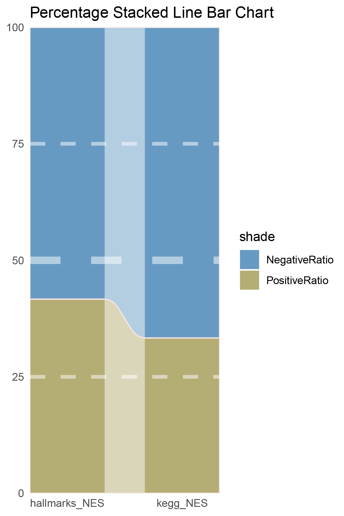
correlation_outRst_ALOXE3_NES_RATIO
15.4.1 ALOXE3_ALL
ALOXE3_ALL_RATIO
15.4.2 ALOXE3_seprate
ALOXE3_seprate_RATIO
15.5 ALL Percentage Stacked Line Bar
ALL Percentage Stacked Line Bar
15.6 Discussion
In both methods, although the ratio of positively and negatively correlated genes is 0.5 for all genes, when the absolute correlation value exceeds 0.5, the proportion of positively correlated genes starts to exceed that of negatively correlated genes. This indicates that with stronger correlations, the selection bias of the methods changes significantly. This trend is further amplified in pathway enrichment, with the number of activated pathways far exceeding that of inhibited pathways, sometimes with no inhibited pathways at all, which differs significantly from the trend observed in the gene correlation ratios.
TransPropy is the only method among the five that achieves a near 0.5 ratio for both positively and negatively correlated genes, as well as for genes with absolute correlation values greater than 0.5, while maintaining the smallest fluctuation range. It also shows the most consistent trend between the proportions of activated and inhibited pathways and the proportions of positively and negatively correlated genes, remaining relatively close to 0.5. This indicates that TransPropy can balance the identification of various characteristics (such as positive and negative gene correlations and pathway activation and inhibition) both at the gene level and the pathway level (gene sets). This balance not only prevents biases and non-biological characteristics in results caused by data imbalance or parameter assumptions of the algorithm but also comprehensively considers feature performance and their interactions. (Better)
In both methods, the proportion of positively correlated genes is greater than that of negatively correlated genes. This phenomenon is especially evident in genes with absolute correlation values greater than 0.5, indicating that for features with stronger correlations, both methods further amplify their selection bias. However, this trend is reversed in pathway enrichment, where the number of activated pathways is less than that of inhibited pathways. In the RST method, the number of activated pathways is particularly small, which significantly differs from the trend observed in the gene correlation ratios.